3D DDD Gives Another Example of the Risky Parabolic Arc Pattern
We’ve seen more “parabolic arc” or emotion-fueled impulsve ‘blow-off’ price movements lately, and DDD gives us another example of how these patterns form and resolve.
We can also take a look at basic trading tactics of how to manage risk, avoid emotion (which fuels the pattern) and seek to profit for those with strong risk-tolerance.
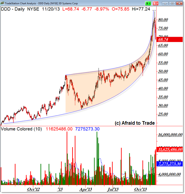
Here’s the Daily Chart of the “Arc” or Parabolic Pattern and the recent reaction once price crosses through the vertical trendline (it’s rarely ‘pretty’).

Generally these type of price patterns are fueled by a steadily increasing urgency to get into a position (buy shares) which reaches a fevered pitch and eventual climax ahead of a trend reversal after price goes “parabolic” or literally straight up on the price chart.
These similar patterns can take years to develop or they can happen rapidly on an intraday chart – the logic is the same.
Patterns (including rectangles, triangles, head and shoulders, etc) tend to be driven in part by the emotions – simplified as ‘greed and fear’ – of participants putting on and taking off positions (both long and short).
Climactic events tend to occur – and are fueled – by a one-sided dominance that becomes clear and exacerbates over time.
Buyers become more urgent to get into a rising trend (‘fearful’ that they will miss out and ‘greedy’ that they can make a quick profit easily) while short-sellers become more urgent to exit losing positions (‘fearful’ of losing a lot of money quickly from their original ‘greed’ of short-selling/fighting a trend in motion with the gratification of calling that elusive top/reversal).
These dynamics play out on the chart and price can indeed go “parabolic” or vertical which creates risk for both sides of the market.
For bulls/buyers, the pattern will end – it’s inevitable – and the end of the emotion-fueled rally often results in a stellar decline/reversal.
For short-sellers/bears, the price movement and emotional factors can propel price vertical well-beyond what is logical, even if they “know” the pattern will eventually end. It can result in significant financial losses in calling that elusive top too early – despite eventually being correct in their logic.
The general trigger-point – if buyers can step away from their emotions and sellers can remain calm – is the crossing through of the arc or vertical trendline.
We can look to other factors such as clear negative volume/momentum divergences or reversal candles (or Elliott Wave counts or any number of chart based strategies or indicators) but again, the power of the emotional ‘feedback loop’ can overrule even the best indicator, strategy, or logic.
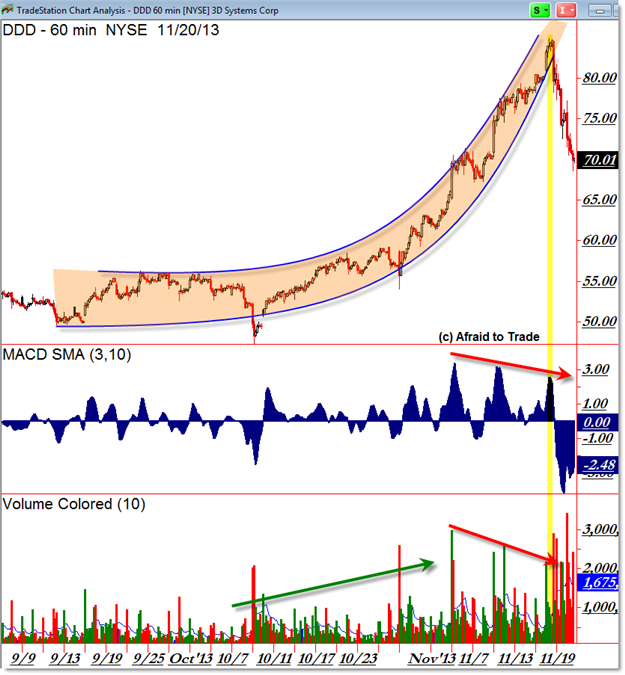
When a Parabolic Arc climactic pattern develops on a Daily Chart, it’s often best to drop to the intraday frames to see entry/exit signals (and manage any open positions) more clearly:

Note the rise in volume and momentum (confirmation) during the early part of the arc trendline (early November on the break above $60) which suggested additional upside price action that indeed resulted in the “Arc” or Parabolic pattern which was met with a clear decline or negative divergence (non-confirmation) in both Momentum and Volume.
Note also – which we can see in hindsight – the violent downside price action and surge in bearish/distribution volume. This tends more than not to be the eventual outcome of many Parabolic Arc/Emotional patterns.
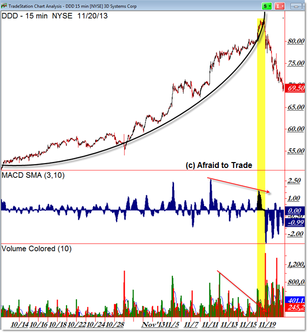
The 15-min chart steps further inside the supply/demand emotional picture:

Once again, these type of “blow-off” or climactic reversal patterns should be traded by experienced/aggressive traders only.
Unfortunately, the emotions of new or inexperienced traders tend to help create these patterns (especially toward the eventual ‘top’) and it’s these same traders who tend to get hurt the worst – by holding on to losing positions – during the violent downside reversal pattern (which is a shortable opportunity – even with options – for experienced traders).
Speaking of options, it can be a great compromise to trade these events with options, both on the outright call buying (on the upside) and put buying (on the downside) due to the fixed losses that options contracts can deliver if a position goes the wrong way.
This is an added benefit to those who want to “call a top” by putting on an option position and holding it until the climax occurs… but even if the climax does not occur, the end-result of an option contract going to zero is superior than an outright short-sold position experiencing incredible losses.
The same would be true to those who just can’t resist the emotion to play long into a strongly rising trend – just remember you’re likely playing a dangerous game of Musical Chairs… but straight call options can make the game a little less dangerous.
If you’re new to trading options or just would like a refresher course on them, check out my colleague and affiliate John Carter’s new video entitled “Nine Reasons Why You Should Trade Options (on ETFs)” (he explains why options are his preferred trading vehicle) and we can perhaps add a 10th reason – trading parabolic arc pattern opportunities!
Corey Rosenbloom, CMT
Afraid to Trade.com
Follow Corey on Twitter: http://twitter.com/afraidtotrade
Corey’s new book The Complete Trading Course (Wiley Finance) is now available along with the newly released Profiting from the Life Cycle of a Stock Trend presentation (also from Wiley).

the same fractal pattern (with negative divergences) on multiple time scales.
yet we're told that trends don't exist and such patterns happen randomly?!
Indeed – I've seen it and traded these types of patterns intraday. History tends to repeat because people tend to make the same mistakes and respond the same way when presented with similar stimuli – and it shows up pictorially on the charts. Thanks for you comment!