A Haunting Look at the Line in the Sand in 1930 Dow Jones
Let’s take a look at the Dow Jones chart of 1930 post 1929 crash from the eyes of a simple technical analyst (chartist) and what he or she might have written in real time in 1930 as the market faced an eerily similar “Line in the Sand” to what we face today…
* * * 1930 * * *
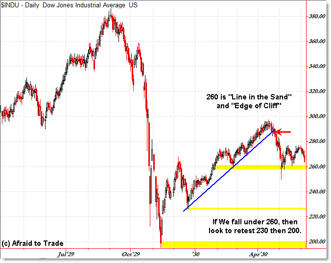
Let’s take a look at the critical levels to watch on the Dow Jones chart for a quick reference:
(Click for full-size image).
Well folks, here we are again at the 260 Index level. We’ve tested this level three times in the past, and each time this level held.
We can see that the market had a stellar recovery off the lows at 200 from November 1929, but now the market faces a critical turning point.
Under the first scenario, we bounce solidly off 260 and continue the bull market uptrend that began from the November lows – we would thus label this a deep retracement and expect price to continue higher, particularly if we break above the current trading range and overhead resistance at 280.
We can see that 260 also represented the price low from late February 1930 – that adds to the validity of the support level.
I try to keep my charts as simple as possible, so we would be bullish for a breakout above 280 to target 300 then beyond… but folks if we break under 260, we’re likely to see a retest of the prior lows at 230 which was the late December 1929 low.
If we can’t hold support there, then we could indeed see a return all the way back to 200 which would be the next level of key support to watch.
Therefore, keep your bullish eyes on a break above 280 and your bearish eyes on a break under 260.
* * * 2010 * * *
And… now we’re back in 2010.
Is the situation – and analysis – any different?
The only difference is that the 1929 scenario uses daily bars while the current scenario uses weekly bars – and it is almost identical in so many ways.
If it doesn’t give you that “Twilight Zone” eerie feeling… then you aren’t looking closely enough.
Want to make it more eerie? I ended the chart from 1930 almost to the exact day as today’s chart – early June … 70 years ago.
Keep in mind that the comparisons and structure may end at any time… but so far they have not.
“Bulls Willing to do Anything to Avoid Falling into the Abyss”
“Third Time’s a Charm? SP500 Tests Line in the Sand”
S&P 500 Poised on the “Edge of a Cliff”
Edge of Cliff Level to Watch in the Russell 2000
Corey Rosenbloom, CMT
Afraid to Trade.com
Follow Corey on Twitter: http://twitter.com/afraidtotrade


Fantasic charts. It is the twilight zone.
great charts..thanks 🙂
Nice site I like everything about it but your photo, I don't know what it does for you ….does nothing but detract for me.
We begin by gaining a sound understanding of your sector, company targets, and target
audience.