A Quick Way to Chart the Cycles in Volatility
There’s a quick and easy way to chart Volatility and assess whether we’re in a low or high volatility period and what’s likely to happen next in the cycle.
Price alternates between periods of High Volatility to Low Volatility and it’s important to adjust your expectations and trading strategies as necessary.
Let’s see one of the easiest tools to chart the Volatility Cycles (highs and lows):

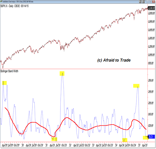
I’m showing the indicator “Bollinger Band Width” which simply subtracts the value of the Lower Bollinger Band from the Upper Bollinger Band.
Bollinger Bands measure two Standard Deviations from the mean or 20 period moving average (default).
High volatility periods in price will increase the standard deviation – and thus the distance of the upper and lower bands – and low volatility periods will decrease the standard deviation and distance.
We can simply chart the width of the Bollinger Bands as an easy measure of Volatility.
You get what you see in the chart above of the S&P 500 (daily) from the 2009 low to present.
Note the “waves” or periods of high and low indicator values that almost look like a steady wave.
I drew a larger red line through the middle of the “waves” to highlight trends in the Volatility Cycle.
Take a look at my prior post “Current Volatility Environment Forecasting a Higher Volatility Environment” and this morning’s update “Still on Breakout Watch for the S&P 500.”
We’re in a low Volatility environment with the Bollinger Band Width indicator registering under 80 – something that has occurred roughly four times since the 2009 low.
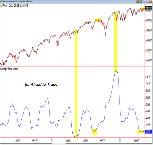
Here’s a closer perspective of the Daily Chart and BB-Width Indicator (showing the Cycles):

Keep in mind that the blue indicator does NOT measure direction but instead volatility in the form of a standard deviation function.
Generally, periods of low volatility correspond with a swing high and sideways price action (like we’re seeing now) ahead of a future sell-swing retracement or sudden move to the downside.
However, note the end of 2014 where price rapidly fell and then even MORE rapidly rose to close 2014 at the highs.
A High Volatility Environment does not necessarily mean price is falling, though this is almost always the case.
With price again coiled or compressed at the highs and Volatility (measured by the simple Bollinger Band Width Indicator) is at a very low reading relative to the last five years, we’re in a “wait and trade” mode for a future breakout to new highs or – perhaps logically – yet another quick sell-swing to lower support targets.
Either way, be prepared, patient, and eager to trade and adapt to the upcoming new environment of higher volatility.
Follow along with members of the Daily Commentary and Idealized Trades summaries for real-time updates and additional trade planning.
Corey Rosenbloom, CMT
Afraid to Trade.com
Follow Corey on Twitter: http://twitter.com/afraidtotrade
Corey’s book The Complete Trading Course (Wiley Finance) is now available along with the newly released Profiting from the Life Cycle of a Stock Trend presentation (also from Wiley).


Here it looks pretty simple but trust me it’s far from it, if we are trading without any experience then doing this will be next to impossible and not just that, but our confident will also be dented badly, so we have to be extremely careful before doing anything like that or else it can be a very tough journey. I can be bit fearless due to having 50% bonus from OctaFX broker and the best part is that it’s completely useable for us.