Charting Presidential Stock Performance from Carter to Obama
With the 2012 Presidential Campaign now in full swing, I thought it would be interesting to observe prior performance of the stock market under the different presidential administrations from Jimmy Carter to Barack Obama.
The charts below all begin and end on January 20th as the starting and ending day of a presidential term for comparison purposes.
Each chart plots the S&P 500 Index activity throughout each term.
Charts are presented without commentary and without any sort of bias.
Be sure to read the brief caveats at the end of the post:
Jimmy Carter: 1977 – 1981

Ronald Reagan (1st): 1981 – 1985

Ronald Reagan (2nd): 1985 – 1989

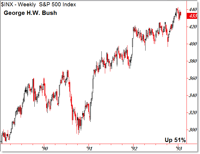
George H. W. Bush: 1989 – 1993

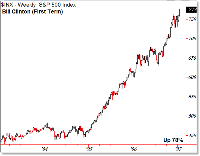
William “Bill” Clinton (1st): 1993 – 1997

William “Bill” Clinton (2nd): 1997 – 2001

George W. Bush (1st): 2001 – 2005

George W. Bush (2nd): 2005 – 2009

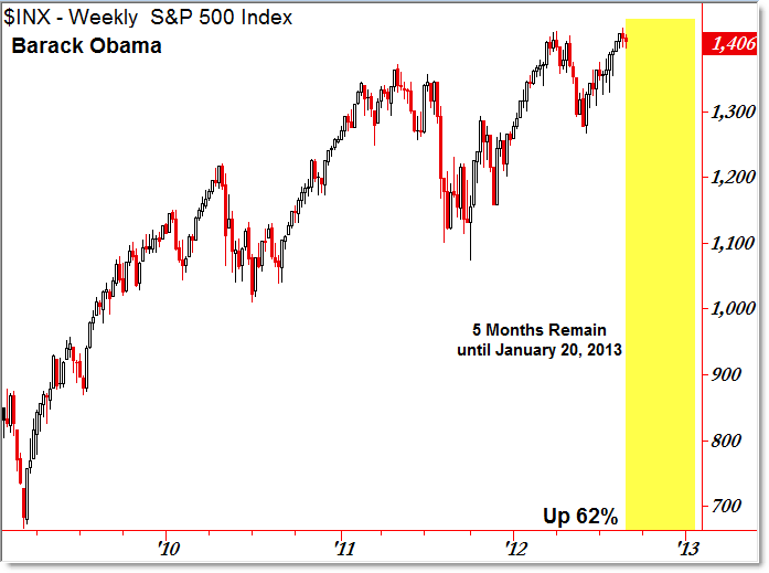
Barack Obama (5 months remain): 2009 – 2013

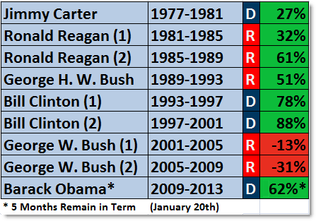
Composite S&P 500 Percentage Performance (by term):

Quick Caveats:
- No president can implement all the policies he wishes.
- Administrations are constrained by Congress (House and Senate), Lobbyists/Interest Groups, Public Opinion, and finally the Supreme Court.
- Many presidents have encountered “Divided Government,” where the Congress is controlled by the opposition party (Reagan, Clinton, and Obama, for example).
- Events always occur that are out of any president’s control. Also, the government does not control the economy.
- Policies that help or hurt the free market economy include tax policies (rates), regulatory policies, and federal budgetary policies/investment (to name a few).
- Policies implemented may take months or even years to affect the economy.
- A better method for assessing stock market and presidential performance may be to start the comparisons after the first full year of a new administration (with the exception being the re-election of incumbents)
- The policies of the independent Federal Reserve (interest rates, stimulus) greatly effect the broader economy.
Despite the numerous caveats for extrapolation, it’s interesting to observe how the stock market has performed over specific administrations, particularly with respect to major events (1987’s crash, the late 1990’s tech bubble, the early 2000’s tech crash, the September 11, 2011 terrorist attacks, the 2008 crash).
The most interesting observation I had is that the stock market has such a bullish 4-year performance over all administrations, save for 2001 – 2009 (two recessions that occurred like book-ends to the decade).
As the campaign continues into the November 2012 election, it’s interesting to learn about stock performance under prior administrations and policies.
Corey Rosenbloom, CMT
Afraid to Trade.com
Follow Corey on Twitter: http://twitter.com/afraidtotrade
Corey’s new book The Complete Trading Course (Wiley Finance) is now available!

Do you have this available as an excel with specific data points?
Joe,
No, I took the closing data from TradeStation and used this in the calculations with respect to beginning and ending terms of the presidents. An Excel post would have been a helpful resource, though.
Average gain for R: 20%
Average gain for D: 64%
We grow 3x times faster if a D is in power (historically).
Record high groth: D (88% Bill C)
Record low growth: R (-31% GW)
These numbers are meaningless if not adjusted for inflation.
it's more to do with congressional control than the president…..do that study and see what happens
You can certainly see your enthusiasm within the work you write.
The world hopes for even more passionate writers such as you who are
not afraid to say how they believe. Always go after your heart.
My web site internet marketing blog [Selina]