Charting the Recent Weakness in Financials XLF
Financial stocks have seen relative weakness with companies in other sectors, as evidenced by the lackluster performance and recent support breakdowns in the leading Financial ETF – XLF.
Let’s take a Daily then Weekly view to learn lessons from the structure, and see current reference levels to watch.
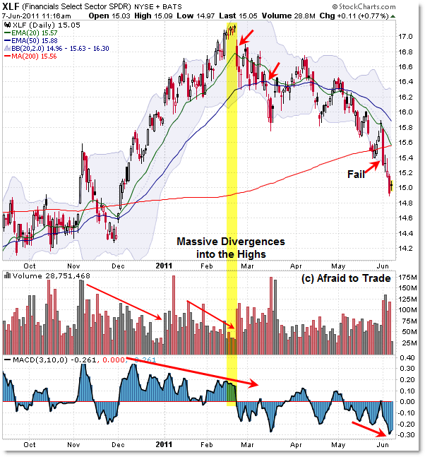
First, the Daily Chart (notice the “Arc”):

Let’s start first with a trading lesson in terms of the divergences at the high in February ahead of the reversal.
This is a good reference example of how negative volume and momentum (3/10 Oscillator) divergences served as broad non-confirmations of the new recovery high at $17.00 per share.
Notice the string of five doji (reversal) candles that formed into the upper Bollinger Band at this time.
If you see this pattern in real time in the future – reversal candles into the upper Bollinger Band when price is undercut by lengthy negative divergences – take profits quickly.
Aggressive traders could consider setting up a reversal play into this structure or – preferably – on confirmed price breakdowns of rising trendlines or moving averages. If you miss the perfect entry – we all do – there’s almost always two or three good entries into a swing move like this.
I’m showing two of them in terms of the first breakdown of the rising 20 day EMA with an impulse candle on February 22. The other safe opportunity was on the breakdown under the rising 50 day EMA on March 14/15.
Price “flagged” (bear flag) its way down to the target level of the 200d SMA and November 2010 price high, which I showed in the post: “Triangulating FAS Challenges Critical Support” (while FAS is different than XLF, the structure on the chart was similar at the target test level).
After a four-day rally into EMA target resistance off the critical support level, sellers pushed the financial ETF back under the rising 200d SMA and swing low, creating a “failure to rally” signal (or successful breakdown – depending on your perspective).
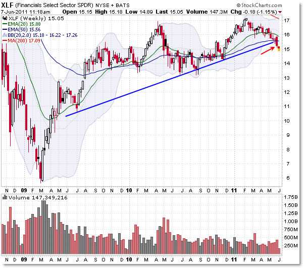
It wasn’t just the 200d SMA that was important at the $15.45 level – it was a long-standing rising weekly trendline on which price initially supported… that broke last week:

Starting with the June 2009 swing low, we can draw a trendline up that connects three additional swing lows in the context of the recent recovery/rally.
Price broke down under that rising trendline last week – at the same time it sliced through the rising 200d SMA.
Cutting right to the chase, the XLF ETF takes a bearish confirmation turn as long as it’s under this trendline and the 200d SMA – both currently converging at $15.60/$15.80.
The classic chart expectation would be to look for further price deterioration, and the alternate scenario would be to expect a bullish surprise or short-squeeze should the ETF rally back above $16.00 (to be safe and to have an easy-to-remember reference level).
Lower targets include the $14.30 area (November 2010 low) and beyond that is the 2010 “triple-tested” lows at $13.20.
In other words, unless buyers pull off a big surge to the upside soon and bust this recent bearish development, the “path of least resistance” (reference my Wyckoff Imagery Lesson last week) is now to these downside levels.
Corey Rosenbloom, CMT
Afraid to Trade.com
Follow Corey on Twitter: http://twitter.com/afraidtotrade
Corey’s new book The Complete Trading Course (Wiley Finance) is now available!

Does that mean you shorted where you have red arrows marked on the daily chart and made tons of $$ or this is just informative.
Its easy to spot once the dust is settled 🙂
The point of studying lessons and examples like this – salient concepts like divergences for example and the other chart evidence surrounding them – increase our chance to recognize these same concepts/opportunities in real time when they occur in the future.
Those who do not learn from the past aren't necessarily doomed to repeat it, but they'll miss great trading opportunities like this in the future if they don't know what to look for.
The point of studying lessons and examples like this –
salient concepts like divergences for example and the other chart evidence
surrounding them – increase our chance to recognize these same
concepts/opportunities in real time when they occur in the future.
Those who do not learn from the past aren't necessarily
doomed to repeat it, but they'll miss great trading opportunities like this in
the future if they don't know what to look for.
Corey – Well put! I am sure these lessons you mentioned seasoned investors are well aware of.
With that said my question is still not answered did you buy or still in the learning process ?