Current Hourly Price Structure and Insights for the Dollar Index
I wanted to take a moment and remind you of the importance of analyzing price “Structure” when setting up what type of trades you are wishing to take, or how to be positioned for a swing or longer-term trade in a given market.
Price Structure is probably the simplest form of Technical Analysis, but I see so few traders discuss it, or even take the time to do the work to uncover structure.
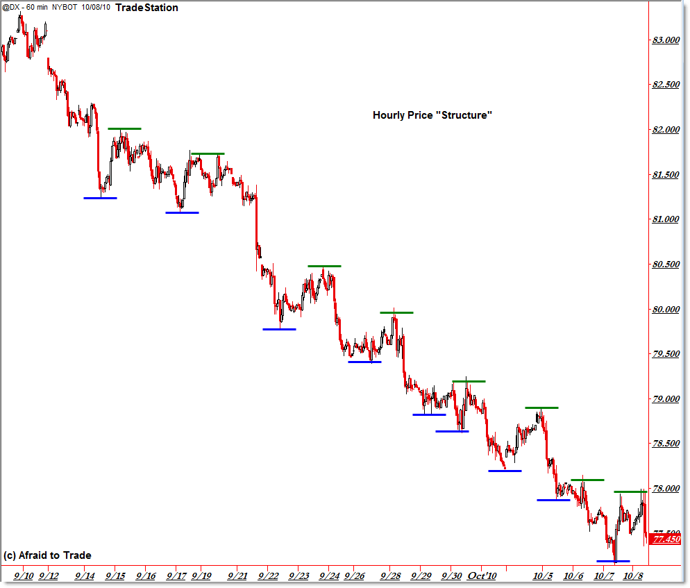
Let’s review how to identify a market’s “Price Structure,” and find out what that structure is currently on the Hourly US Dollar Index (futures – @DX) Chart.
Hourly @DX US Dollar Index Futures:
(Click for Full-size image)
First, let’s define “Structure” and apply it to the Dollar Index.
From a most basic standpoint, price structure is the progression of swing highs and swing lows over time that “build” (form the foundation of) price trends.
Simple, right?
So what’s the easiest way to identify price structure of a market (or stock)? That’s right – remove all the fancy indicators and look at the pure price.
I like to do screen captures of charts into Snag-It (or whatever screen-capture program you prefer) and then copy/paste the little lines as I’ve done above.
There’s something about doing the work yourself like that that causes the structure to leap off the chart, though you can see it already without the little bars or lines.
The rules are the following:
- Don’t count every little squiggle as a swing; only identify key swing highs and swing lows.
- Show all relevant swing highs and lows; I prefer to use two different colors for highs and lows.
- Compare the progression of swing highs and lows over time to identify structure.
For a quick review, Up-Trends are officially defined in technical analysis as:
“A progression of higher swing highs and higher swing lows”
while a downtrend is defined as:
“A progression of lower swing highs and lower swing lows.”
By extension of logic, a trend is reversed ONLY when the progression is broken BOTH by a higher high AND a higher low (ending a downtrend) or vice versa – a lower low AND a lower high ending an uptrend.
Has that happened yet in the US Dollar index?
Absolutely not – under no circumstances could you remotely call this an uptrend or even the beginning of an uptrend.
Price would need to make a higher high (go above $78) or this current swing would need to bottom out above the recent swing low at $77.
Until then, any long/buy trade you make, or reversal trade has low odds of success as you fight a dominant trend in force.
Traders who tried to call a bottom yesterday were taught this painful lesson this morning with a 50 cent sudden plunge in the index.
That’s not to say $77 isn’t the absolute low of the move, but we need PROOF of that before trying to fight the trend long (in terms of edge optimization and risk management).
Until a trend is officially reversed, odds favor trend continuity over trend reversal – that is the #1 principle of Technical Analysis (according to Pring, Murphy, Raschke, Dow, Wyckoff, and many more).
Taking the few minutes it takes to draw out a “Structure Grid” like the one above for any timeframe of a market or stock you’re trading.
Doing so and understanding its importance can save you so much money and frustration.
Corey Rosenbloom, CMT
Afraid to Trade.com
Follow Corey on Twitter: http://twitter.com/afraidtotrade


You can create this view automatically on stockcharts,com by using the ZigZag overlay, e.g.:
http://stockcharts.com/h-sc/ui?s=$USD&p=D&yr=0&mn=3&dy=0&id=p52461574849
Good call! Thanks for sharing.
I like the hand-drawn lines as opposed to the zig-zags but the main idea is to the the concept right with whatever tool works for you.
One might need to adjust the sensitivity of the indicator so as not to incorporate all those minor swings.
Great post Corey
Has the dollar index bottomed?