Gann Chart Art in the 10 Year Yields
I thought I’d try an experiment with the 10-Year Treasury Yields Long-Term Chart and apply a little Gann analysis in terms of squaring price and time to see what the result might be.
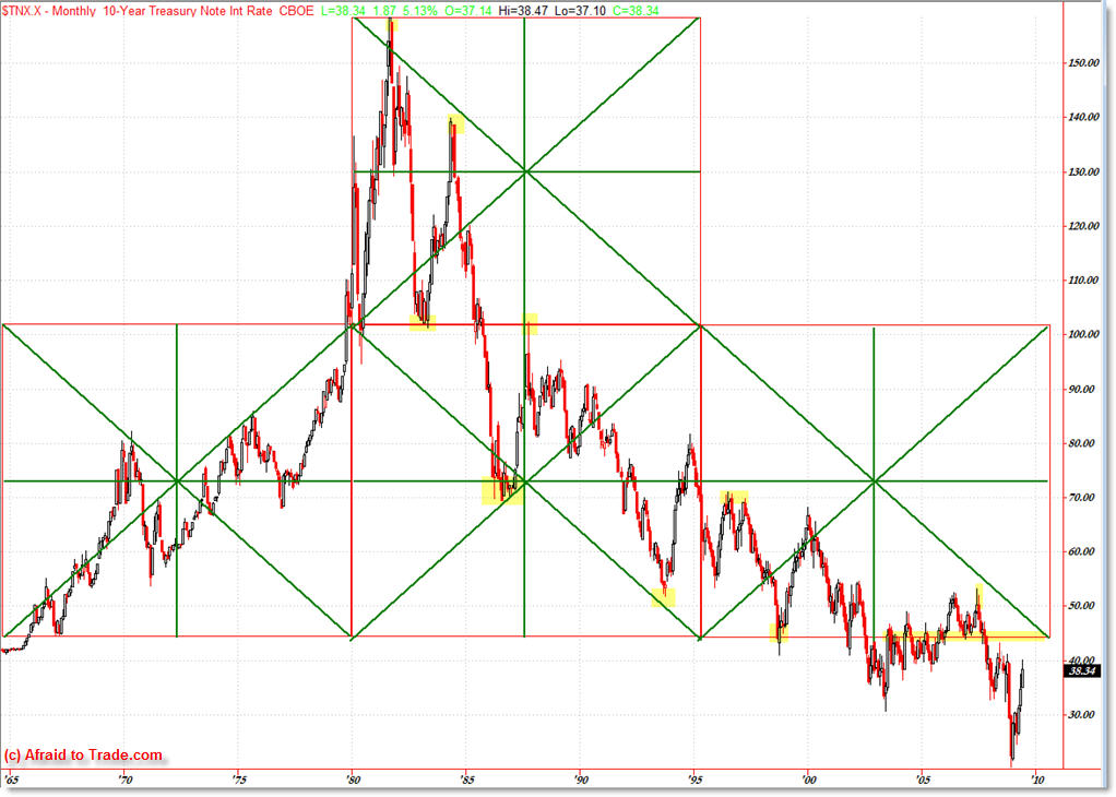
Here’s the “chart art” from my experiment which probably should be filed under “Interesting” as opposed to “Actionable.”
Ten-Year Treasury Yield “Chart Art”
One of my clients calls this my “Mad Scientist” type experiements when I’m ‘cooking up’ new ideas or applying the deeper level technical tools such as Gann and Fibonacci, many times of which I don’t share publicly on the blog but I thought some readers might find this interesting.
I started with the orignal square on the left which comes off a secondary swing low (that’s important in Gann terms) and then squared the time and price by drawing in the diagonals to achieve a perfect square.
From that original ‘seed’ (the move from 1965 to 1980 – 15 years) I then simply copied and pasted both the square and the diagonals to get the three resulting squares and subdivisions.
We’re most interested in seeing what happens when price comes into one of these ‘nodes’ or lines to see what happens in terms of support or resistance.
I highlighted some of the moments when price inflected off of these nodes – which still appears to me to be magic.
What gets me is that it called the exact top, in terms of doubling the square to the upside. Price then retraced back to bounce off the bottom of the same square (around the 1980 to 1985 period) and then failed at the descending line.
We then found key support at the midpoint of the middle box in 1986 and then later the lower box in 1997.
If we’re trying to apply current analysis, it would seem that the 44.50 (which is 4.50% yield) could be a significant area to overcome… or perhaps we’re completely in a new square at the moment.
For those worried I’ll be changing my style – I won’t. This is a test – this was only a test/experiment.
If there’s any Gann enthusiast readers, feel free to comment or contact me – I’m a Gann neophyte but I find the geometrics very interesting.
Happy charting!
Corey Rosenbloom, CMT
Afraid to Trade.com
Subscribe for the RSS Feed here.
Follow Corey on Twitter: http://twitter.com/afraidtotrade


Corey this is really cool! Thanks a lot for being willing to show us your experimental work – I hope you do more postings like this. I'm a firm believer, based on my experience trading with cycles, that time is as important as price. When time and price converge there is a strong possibility of a reversal which makes for high probability trades. Gann was the man, when it come to this both in terms of his squares and his work with astrology.
All the best,
Mo
Corey,
I think your blog posts are great… it's opening a door for thought and discussion. Please do push the envelop into “experimental” terain. While it's nice to feel supremely confident that a analysis is spot on, sharing ideas and perspectives can elicite some interesting views and exchanges that may open other doors.
Bob