Intraday Triangle Pattern Forecasts SPY Breakout
Have you seen the triangle pattern that’s been forming over the last few days in the S&P 500 or SPY?
If not, let’s take a few chart glances at the pattern, explain what it means, and what we can expect in the week ahead from the pattern.
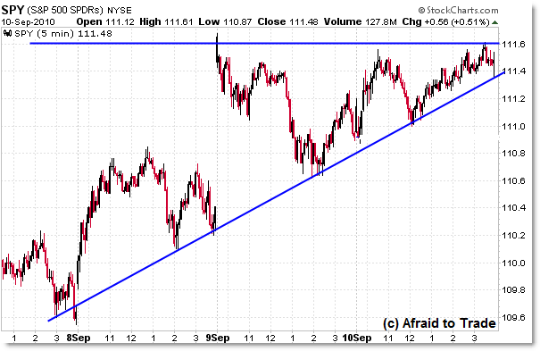
First, the pure price glimpse at the ascending triangle:

Ascending triangles form when price ‘smacks’ into an overhead resistance level, but as that level holds, price forms a series of higher lows in the context of a rising trendline.
That’s what we’re seeing in the SPY, with the upper resistance level at the $111.50. Over the last few days, price respected a clear rising trendline that currently ends at the $111.40 level.
So, one of those two trendlines is about to break… or stated differently, price is about to break through one of those trendlines.
According to the Price Alternation Principle, price alternates between periods of range contraction (like triangles) and range expansion (like breakout moves).
Given that we’ve currently formed a clear price compression pattern, odds favor a range expansion breakout move to occur soon. Or at least that’s what the principle states.
Officially, we can’t predict with 100% certainty which direction price will break, but we can anticipate a potential big breakout move one way or the other.
We can, however, look at other indicators and higher timeframes to assess the odds of an upside or downside break.
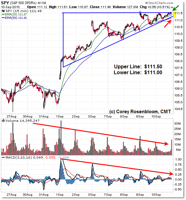
Let’s do that now with the 15-min intraday chart:

I’ve added volume and the 3/10 Momentum oscillator to the mix.
During the entirety of the price rise, both volume and the momentum oscillator have been declining. That’s a classic non-confirmation of the price rise, and it suggests that the rise is likely to result in a downward resolution.
In other words, to expect bullish price continuation, we want to see both volume and (hopefully) momentum RISE as price rises.
If we don’t see this, then it is a bearish caution signal – and that is the message from momentum and volume: Caution!
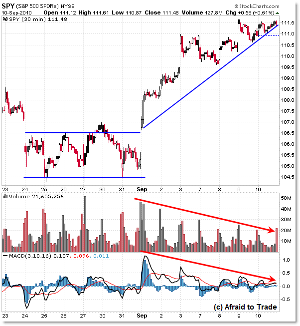
Let’s take one more quick look at the 30-min chart before seeing the daily structure and levels to monitor:

On the 30-min chart, we see the exact same negative volume and momentum divergences – that’s bearish.
The rising trendline actually extends back beyond where I drew the line on the 5-min chart.
And in fact, the 30-min chart gives us an example of how the Price Alternation Principle works.
Price ‘consolidated’ in a sideways rectangle from August 24 until the powerful range breakout on September 1st.
Again, from consolidation comes expansion. Price expanded sharply to the upside before volatility wound back down into our present triangle pattern.
From that principle, we would expect a range breakout move soon to come.
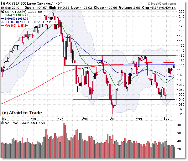
Where might that range breakout take us? Let’s turn to the daily chart for clues:

Without getting too detailed, we have three price levels to watch on the daily chart.
Right here, price is having trouble overcoming 1,110. It’s not a super significant level by itself, but above it is the convergence of the 200 day SMA – which has been moderately important lately – and the upper Bollinger Band.
These rest at the following levels respectively:
Upper Bollinger Band: 1,117
200 day SMA: 1,115
What if the breakout is indeed to the upside, slicing above this resistance?
Then we’ll almost certainly hit 1,130. That’s the “double top” resistance from June and August’s highs.
In the event that the breakout is “the real thing,” then any breakout above 1,130 will be a big deal and stop-out a lot of short sellers (triggering a short-squeeze) as buyers rush into the market. Such an event could propel the market up to retest the 1,170 prior high for an initial breakout target.
What if the breakout is to the downside?
Given that the 20 and 50 day EMAs have not really been all that important in terms of turning points in the market lately, we would possibly expect an eventual target of a retest of 1,040.
Keep in mind, we’re not just in a short-term triangle, but a 3-month rectangle pattern.
And eventually, price must break out of that rectangle too!
This is the type of structure I use each day with members of the Idealized Trades Report – building analysis from the lower timeframes up to the higher frame and setting up our “IF/THEN” statements for the next trading day. Intraday reports also focus on ‘teaching’ concepts, patterns, opportunities using examples from that trading day – history repeats.
For those who aren’t intraday traders, I work the other way in the Weekly Report, which focuses on Inter-market Analysis (Bonds, Stocks, Gold, Oil, Dollar). I start with the monthly chart and then travel down to the weekly and then daily chart, highlighting patterns, opportunities, and things to watch.
Stay alert – if we do start to see a breakout occur early next week from these levels, be prepared!
Corey Rosenbloom, CMT
Afraid to Trade.com
Follow Corey on Twitter: http://twitter.com/afraidtotrade

volume falling off due to the holidays no? in this case is the drop of volume really that significant?
Thanks for filling in the gap I didn't have down–the volume and mo signals. I thought seriously about putting in an SDS position over the weekend because I saw the triangle and the resistance lines, but I'd read stuff about triangles being 90% bullish, and so lacked confidence. Couldn't decide between the Manic Monday effect and the Elliott wave effects.
@1212, it's funny how hoidays are often the precursors to large movements right afterwards. THe LATE Labor Day took volume out of the monthly data that came in the 1st week of Sept, which wil magnify the effect of next week's midweek data.
Regards
Exactly – so it's not as glaring a chart signal as if we were in a regular environment.
The rally into resistance on declining volume now is eerily similar to what we saw in June and early August – both of which resulted in downside resolutions, so we'll see if that pattern repeats.
I take it that a lot of traders are shorting into the rally here and placing stops above the 1,130 level (SPX). If we do get a sudden breakdown (or breakout), it will likely begin with a gap, similar to that of which broke us out on September 1st. Sometimes the best breaks don't give us clean entries.
great post
really helpful post, thanks a lot
Corey, thanks for the timely article.
Your daily chart is most helpful as it shows a broadening top pattern going back to 1,090 in early June, 2010; as Street Authority relates, when you see the broadening top, the market will eventually drop. The time for dropping is at hand as the S&P has risen to meet strong resistance at 1140.
I would like to present the current market fundamentals.
Debt deflation came to stocks April 26, 2010, when the currency traders sold the major currencies, DBV, and minor currencies, CEW, against the Yen, FXY. This commenced the “bear market of bear markets” in stocks; yes the “mother of all bear markets” is underway currently.
Debt deflation came to bonds September 1, 2010, when the investors rejected the Fed's planned purchase of mortgage backed securities to support more “stimulate and spend”. Investors had been going long in those bonds with greatest out maturity such as ZROS, TLT, and BLV.
The “mother of all bear markets” came to bonds on September 1, 2010; so the investor who goes long bonds, TLT, or BLV, will be caught off guard, by unexpected flattenings of the 30-10 yield curve,$TYX:$TNX, wiping out advances made in being long.
And now, as of the most recent trading day, September 10, 2010, I believe, the S&P, SPY, and the world stocks, ACWI, have completed an Elliott Wave 2 up and are ready to enter an Elliott Wave 3-of-3-of-3 down.
The Elliott Wave count on the S&P is … 3 Down on April 26, 2010, 3-of-3 down on August 10, 2010. And now as of September 10, 2010, ready to go 3-of-3-of-3 Down.
The 3-of-3-of-3 waves are the most aggressive of all waves; they build wealth on the way up and destroy wealth on the way down.
I provided a link to a Stockcharts ChartList of ETF and stocks to sell short …. ZROZ is on that list. One would for example sell it short as it advances. Stocks should be sold short immediately before the opportunity to sell them escapes; an excellent choice Australia, EWA, which has had a good rise on AUD/JPY, that is FXA:FXY, carry trade investing.
http://stockcharts.com/def/servlet/Favorites.CServlet?obj=ID4019834
In other words, stocks, being on the cusp of falling lower represent “the short selling opportunity of a lifetime” … it's time to lock and load … like go all in short with proper stops of course.
Now with bonds having fallen lower we will see a continual see sawing destruction of bond and stock wealth; one is going to have to be an adept short seller.
Debt deflation will progressively and continually wipe out bond and stock wealth. Traditional wealth will be literally sawn asunder by falling currency values, or better said, by unwinding carry trade investments.
Having said that I believe gold bullion offers a much better investment. And dips in the price of gold, that come, will be short lived, as investors escaping a flattening 30-10 US Debt curve, and unwinding yen carry trades, like the EUR/JPY, will be seeking the safe haven of physical gold.