Longterm Color Charting the SP500 and 100 week Moving Average Percentage
In a follow-up to yesterday’s “Color-Charting the S&P 500 Trend Structure with 100 week Moving Average,” I received a few suggestions to normalize the chart using percentage terms – and that’s an excellent idea.
Let’s take a look not just at the recent bull/bear trend structure and percentage performance of the S&P 500 to its 100 week SMA, but go back to the 1970’s and answer the following burning questions:
“At what point was the S&P 500 MOST over-extended (and under-extended) from its 100 week Average?”
“What happened next?”
And of course “What does the past suggest about the present?”
We’ll start with a broader perspective and then take it decade-by-decade to reveal the visual data:
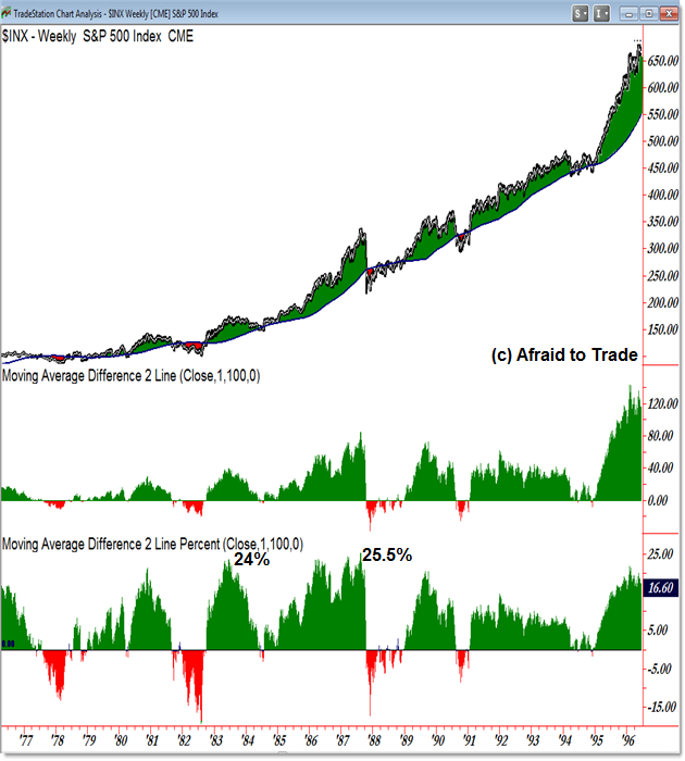
As seen in the prior update which compared price distance from the 100 week SMA, the charts in this update show the same data on the middle indicator (Price minus 100 week SMA) but also takes it one step further to highlight the percentage comparison so we can normalize the visual data.
For example, the S&P 500 recently reached an all-time high “over-extension” from its 100 week SMA. That’s interesting, but it doesn’t provide the complete picture because the index value similarly reached an all-time high near 1,850.
Let’s compare the historical chart above (from 1977 to 1996) to highlight two values:
First, in 1983, the S&P 500 traded 24% above its 100 week SMA.
Second, right before the crash of 1987, the S&P 500 reached its highest (greatest) over-extension, trading 25.% above its 100 week SMA. Price accomplished this feat directly before a collapse in the index.
While the S&P 500 did indeed reach the greatest price over-extension recently, was it greater than the high achieved in the 1980’s bull market?
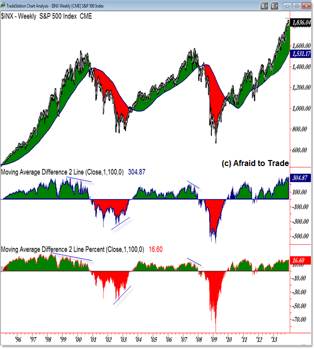
When we view the historical chart from a percentage comparison basis, we see that the index (at all-time highs) trades “only” 16.6% above its 100 week SMA.
On a comparison basis, the 1980s was a stronger period – again from a percentage basis relative to the 100 week SMA – than the current stimulated bull market.
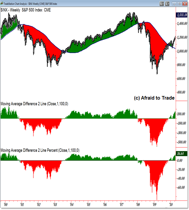
Interestingly enough, the S&P 500 did reach its greatest percentage (and price) distance away from its 100 week SMA to the downside during the 2008 Financial Crisis period.
The index recorded a record low value of 88% beneath its falling 100 week SMA (ironically again near the exact bottom in early 2009).
For comparison, the “worst” bear market value occurred during late 2002 when the index traded 42% beneath its 100 week SMA.
Though not shown on the chart (of the last 30 years), the S&P 500 traded 60% beneath its 100 week SMA in October 1974 during a bear market.
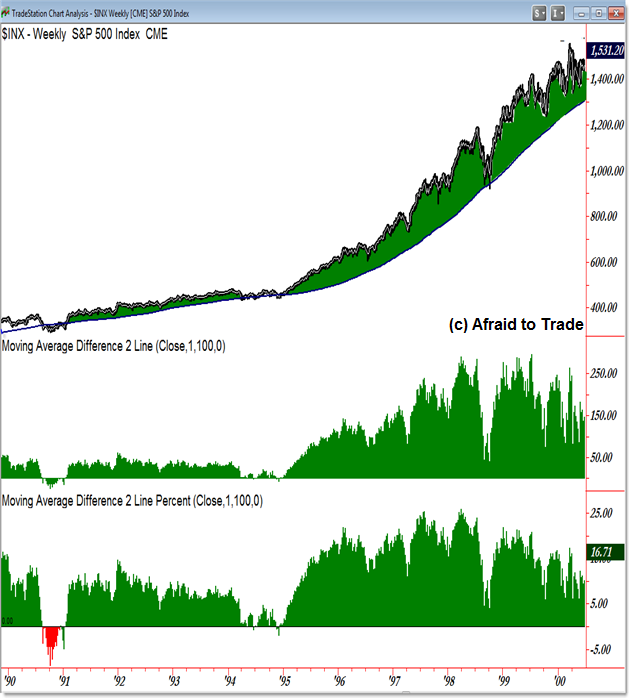
For even more detailed comparisons, I separated the S&P 500 and 100 week SMA performance (price and percentage) performance by decade as seen in the next four color-charts (click ‘Continue Reading‘ for the full post of the detailed charts):
1980 – 1990
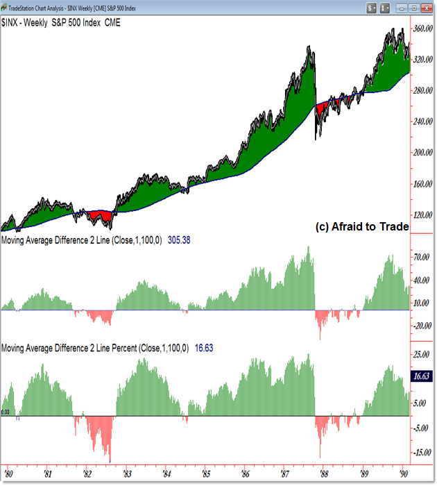
1990 – 2000:
2000 – 2010:
2010 – 2013 (present):
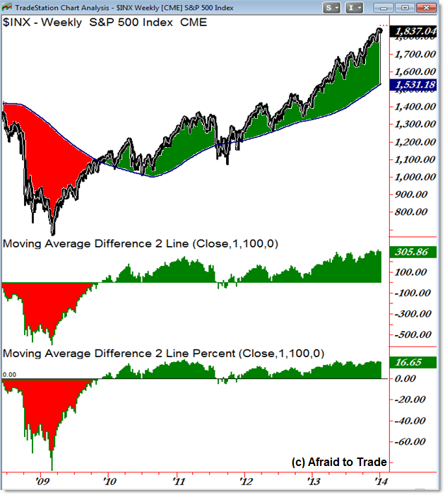
We can make interesting comparisons based on the visual data and draw possible insights for the future based on similar “over-extended” historical values.
Follow along with members of the Daily Commentary and Idealized Trades summaries for real-time updates and additional trade planning parameters as we watch a “hold and bounce” or “break and retrace” scenario play out in the near future.
Corey Rosenbloom, CMT
Afraid to Trade.com
Follow Corey on Twitter: http://twitter.com/afraidtotrade
Corey’s new book The Complete Trading Course (Wiley Finance) is now available along with the newly released Profiting from the Life Cycle of a Stock Trend presentation (also from Wiley).

