Mid-September 2012 Sector Rotation Update
Let’s take a moment to update the current Sector Rotation chart to see which sectors may require our trading attention, and what the broader money flow suggests.
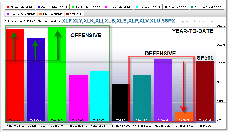
Here’s the broader perspective of performance year-to-date:

From StockCharts, we see the AMEX Sector SPDR ETFs with respect to absolute performance from January to present (mid-September 2012).
We always start with the S&P 500 and then compare sectors under the broader umbrella of “Offensive” (those that do well during bullish phases) and “Defensive” (those that hold their own during bearish phases) sectors.
The S&P 500 is up 16% year to date and we clearly see the pocket of out-performance in the early offensive names such as Financials (XLF up 25%), Consumer Discretionary/Retail (XLY up 22%) and Technology (XLK up 25%).
The two main under-performing sectors are Utilities (XLU up only 2.5%) and perhaps surprisingly Energy (XLE up 10%).
Sector Rotation Analysis serves two broad purposes:
First, it reveals underlying money flow which reveals clues about the strength or weakness of the economy/stock market.
Second, it allows us to focus our attention on leading stocks in the leading sectors, particularly during up/bull phases in the market. One can have a basket of leading stocks in each sector to trade – Apple (AAPL) comes to mind as a Technology leader.
With out-performance concentrated in the “Offensive” Sectors, and under-performance in the Defensive Sectors, this suggests additional bullishness yet to come in the market, at least from a perspective of money flow.
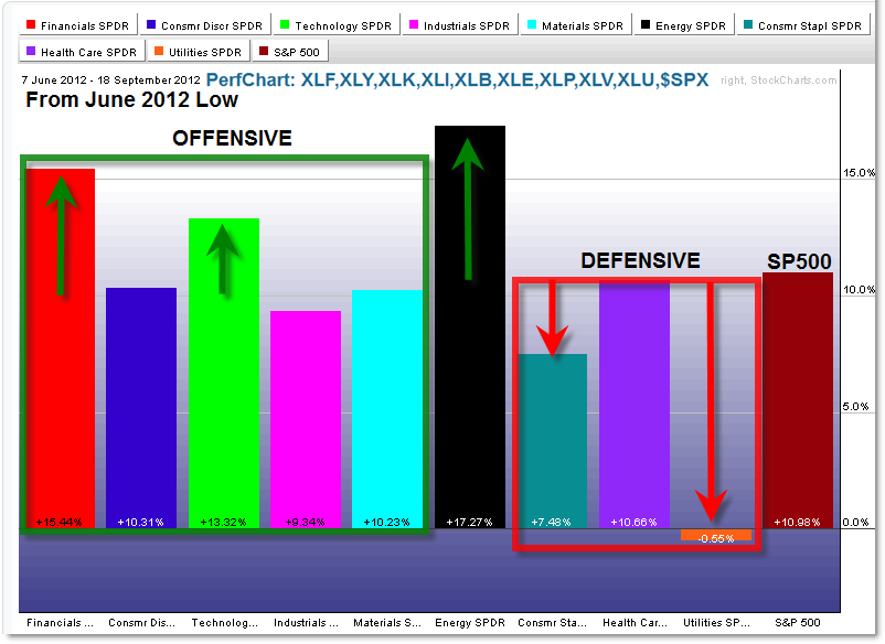
For trading opportunities, one can zoom-in on recent performance from major market turning points, like the recent June 4th 2012 low:

From the June low to present, money has flowed into three “offensive” sectors: Financials (XLF up 15%), Technology (XLK up 13%), and once again surprisingly, Energy (XLE up 17%).
In fact, Energy recently has been the ‘hot-spot’ of sector performance.
Once again, the weakest sector is Utilities which actually lost money while the S&P 500 rallied 10%.
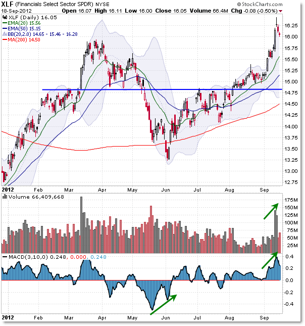
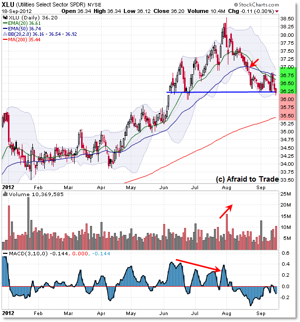
Here are two quick charts of these ETFs for reference:

Similarly to the S&P 500, the XLF ETF traded recently to new recovery highs, breaking above the March 2012 high on a spike in momentum and volume.
Also like the S&P 500, the fund is overbought and pulling back.

When the stock market rallies, not all sectors participate equally; some sectors are consistent leaders while others are consistent laggards.
Utilities – a Defensive Sector – tends to lag (under-perform) the broader market during salient bullish phases as money flows from protective/defensive positions to the more offensive/risk-on opportunities.
Note that XLU stayed muted for the first few months of 2012 and then strengthened noticeably from May to July which corresponded with a sharp decline in stock prices.
As stocks recovered and continued trading higher, Utilities weakened and peaked in late July ahead of a distributive downturn.
One may want to focus on stocks in other sectors such as Energy for additional trading opportunities from current sector rotation money flow.
Unless we start to see a shift back to the risk-off/defensive sectors soon, the broader picture appears supportive for a continuation of the stock market rally underway.
Corey Rosenbloom, CMT
Afraid to Trade.com
Follow Corey on Twitter: http://twitter.com/afraidtotrade
Corey’s new book The Complete Trading Course (Wiley Finance) is now available!

Great article, thank you. I was wondering where you get these sector bar charts, they paint a clear picture of things for me. Thanks again.
Great stuff Corey