Quick Check on the Daily CRB Index
Traders who want to know the direction of inflation often check the chart of the CRB Index, which is a basket of 19 commodities based on 4 main groups.
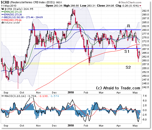
Let’s take a look at the recent chart of the Index and then note important charting levels for reference going forward.

So far, the CRB Index has been trapped within a rectangle trading range between boundaries of 280 as resistance and 267 as support. These will be the main reference levels to watch.
However, in February and just recently, the index broke the lower boundary to bounce both times of the 258 index level, which is important secondary support (S2).
From an economic standpoint…
- a rising CRB indicates inflation in the economy,
- a stable/flat CRB chart indicates dis-inflation (no inflation)
- a declining CRB indicates deflation
Those are simple definitions, but they serve as quick references.
- Rising inflation prompts the Federal Reserve to raise interest rates.
- Flat/stagnant inflation (no inflation) prompts the Federal Reserve to leave rates alone.
- Declining/Falling inflation often prompts the Federal Reserve to raise interest rates.
Again, those are simplistic explanations, but they are good references.
That’s why it’s important for investors – and traders – to keep a good watch on the CRB Index in regard to its trend.
Now, there is no trend and has been no trend since last November – meaning broad inflation (as measured by the CRB Index) is in check for now – and that’s positive.
Gold is surging to new lifetime highs, but oil remains tame.
Keep watching the CRB Chart for any breakout above 280 or a breakdown under 255.
I’m sure the market would be happy if the index stayed between those boundaries for as long as possible, which means the Fed will likely keep interest rates low “for the foreseeable future.”
Corey Rosenbloom, CMT
Afraid to Trade.com
Follow Corey on Twitter: http://twitter.com/afraidtotrade

Excellent analysis, Corey.
Rising CRB index indicates rising expectations for inflation or an economic recovery (rise in demand for commodities). The key concept here is expectations. If enough market participants expect higher commodities prices and act on their assumption, their expectations often turn into a self-fulfilling prophecy and impact the spot market in short-term perspective, causing actual inflation.
The inflation picture cannot be clear without analysis of the steepness of the yield curve; TLT and USD performance. I still believe that we are in a period of moderate inflation and average growth (due to the low basis from 2009), which historically has been beneficial for equities (if we assume that this has not been already discounted by the market).