Stock Market Structure and Support Level Update to Start the Week
As we start the new week, let’s focus on two main ideas in the US Equity Markets – Trend Structure and Current Reference Support Levels.
Let’s start with the S&P 500:

Before we start with the chart, let’s define “Market Structure.”
In simplest terms, “Structure” refers to the progression of price swing highs and price swing lows, with an uptrend defined as a series of “Higher Highs and Higher Lows” and vice versa for a downtrend.
In other words, a Change in Market Structure can occur ONLY with a change in the sequence of highs and lows.
A single lower high, or a single lower low cannot change structure – we need the market to make BOTH a lower high AND a lower low then officially take out the lower low to reverse a structural uptrend that we have in place now.
So with that in mind, in each of the charts I have labeled key (important) Swing Highs and Lows with Green Bars in the progressive uptrend, or a Red Bar as a “Caution” or warning sign of possible reversal.
As structure stands now, the recent action formed both a higher low and higher high in all three equity indexes – and that will be confirmed if we continue to rally off our critical support level as we’ll see in each market.
Starting with the S&P 500, we had a “Warning” with the slightly lower April swing high (you could almost consider that a neutral high) which resulted in a higher low then the recent higher high at 1,370.
In terms of Key Daily Support: Watch the Rising 20 day EMA and critical price pivot at 1,340.
No matter what fundamentals, opinion, or news suggest, as long as the S&P 500 remains above the 1,340 level, the market remains in a bullish uptrend which favors long positions until proven otherwise with a breakdown under 1,320 (50d EMA) then preferably the 1,300 critical “Round Number” reference level. Keep those in mind as you trade the weeks ahead.
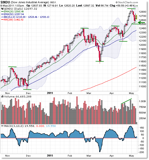
The picture is very similar in the Dow Jones Index:

The only difference in structure in the Dow Jones is that price actually made a slight higher high into April while the S&P 500 matched its 1,340 high.
Also, notice how volume increased slightly during the late-April rally – that’s bullish.
Otherwise, the Critical Daily Support is similarly the rising 20d EMA at 12,650, or the May low from last week at 12,500.
As long as the Dow Jones remains above this pivot, it too is an objective, chart-based uptrend.
A move under 12,400 calls the uptrend into question, and a breakdown under 12,100 (preferably the 12,000 obvious reference level) seriously throw the uptrend into a potential early reversal. Until then, the chart signs are positive until proven otherwise.
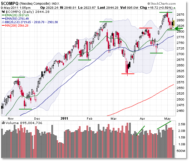
The NASDAQ shows a slightly weaker structure and key reference level support:

I call the NASDAQ Structure weaker because it formed a clean lower high and lower low (due to the deeper pullback/swing low in January, relative to the S&P 500 and Dow Jones) recently as shown by the red lines.
Price did not dip beneath the 2,600 “Differential Pivot,” and has succeeded in producing both a higher low and higher high, reaffirming the powerful uptrend in place and tipping the odds back in favor of the buyers/bulls.
The reference levels for the NASDAQ are the Rising 20d EMA at 2,820, the rising 50d EMA at 2,780, and finally the April swing low at 2,700.
It would likely take a breakdown under 2,600 for an official call of “Downtrend Reversal” in the NASDAQ.
In Summary:
All three major equity indexes show a positive/bullish uptrend structure, along with positively-sloped daily EMAs (also a component of structure), with price above these rising EMAs in all cases.
As long as price remains above the 20d EMA and these support levels, any sort of bearish or counter-trend move is lower probability than pro-trend moves – meaning it’s best to let the market top officially before trying to be the great hero who calls the perfect top.
Let the market tip its hand first by breaking structural support areas before playing out large bearish positions.
If the uptrend does continue as the chart tends to suggest, the easier money will be made by trading with the trend and having logical stops underneath these critical support zones, depending on your own personal trading style and risk-management strategies.
Corey Rosenbloom, CMT
Afraid to Trade.com
Follow Corey on Twitter: http://twitter.com/afraidtotrade
Corey’s new book The Complete Trading Course (Wiley Finance) is now available!

What about the negative divergences in MACD and RSI?
So based on your above analysis does that mean you shorted mid Mar as it fits the conditions you mentioned above ?
Walter.
@Walter:twitter I cannot answer your question, but March looks, to me, to be a 3-push pattern, before the turn down lower.