Structural Comparison of Current Bull Market to 2007 Rally
I wanted to highlight an interesting pattern that emerged from a quick comparison of the 2003 – 2007 Bull Market to the present Bull Market beginning in 2009 (and extending indefinitely at the moment).
Let’s see what possible price pathway may be in store if history is a guide, while being impressed at the similarities between the two structural bull markets.
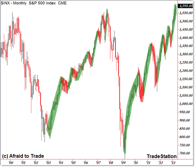
First, the broader Monthly Chart comparison of both bull markets:

I color-coded key monthly swings for comparison purposes.
Note how the present bull market/uptrend has traveled more distance than the prior recovery (current bull: 927 points and counting when compared with the prior bull market 808 points traveled).
Both Bull Markets began with a sustained upward swing to ignite or “kick-off” the trend reversal.
While the 2003-2007 period had smaller monthly retracements, the present bull market had steeper but fewer retracements in the earlier phase of the recovery (new trend).
Toward the end (or at least the end of the 2007 period), both bull markets experienced large upward swings compared to more frequent small or shallow retracements.
It’s this “end of the 2007” period that grabbed my interest, specifically with respect to the structure of the present rally.
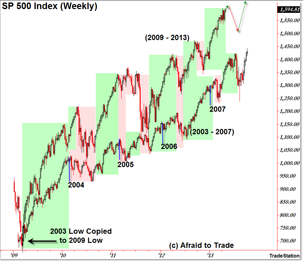
Here’s a special Overlay Analysis chart of both bull markets on the same chart (but different scale):

I copied the 2003 to 2007 price movement and pasted it to the 2009 low to get a sense of the structural similarities – while the upper chart is scaled appropriately, the lower chart (the 2003 – 2007 period) is scaled starting with the 666 low.
Again, we see the strong “kick-off” or sustained upward reaction that began both trend reversals.
From there, we see a steeper 2010 correction than the 2004 period, though both markets continued their uptrends through 2011 (and 2005 respectively).
Again, we see the sharper pullbacks/corrections for the present bull market in comparison with the shallower periods from 2004 to 2005.
Toward the end of the 2006 period, the Bull Market continued with sustained upswings that lasted throughout 2007.
Our current Bull Market also developed strong sustained upward movement through 2012 and of course the present 2013.
While there’s absolutely no expectation that two bull markets will be identical, we can compare their larger similarities, particularly in terms of structure (sequence of highs and lows), distance of swing, and periods of uptrend continuation or counter-trend retracements.
If we look at the current message from 2007, we see a potential pathway for price according to a historical similarity or repeat phase.
I’m focusing my attention on the early 2007 retracement when compared to the late 2012 retracement period, both of which were followed by a sustained, week-over-week rally.
The comparable pro-trend swing from late 2007 rose 188 points while the current swing has traveled 244 points and climbing.
Once again, IF history provides any clue to a possible resolution currently, we see a sharp sell-swing occurring (it began July 2007) ahead of a final peak in October.
We always monitor these type of historical comparison analyses by assessing to what degree the current market “follows a similar structural pathway” as the past along with to what extent price deviates or ‘breaks’ the historically similar pathway.
For now, we will be monitoring for any type of sell-off, and if that does happen (instead of this upward swing continuing to extend well beyond 1,600), we’ll update the comparison to include a potential “rally to a new high” phase.
That’s about as far as we’d want to compare the price pathways for the moment.
Continue monitoring these uptrend structural similarities with respect to the analysis, key levels, and indicators you are using currently.
Corey Rosenbloom, CMT
Afraid to Trade.com
Follow Corey on Twitter: http://twitter.com/afraidtotrade
Corey’s new book The Complete Trading Course (Wiley Finance) is now available

Corey. Very provocative analysis. I wonder about the broad market P/E trend? Thanks.