Triple Volatility Indicator Check on the SP500
Is the market setting up for another period of high volatility?
Let’s take a look at three price-based volatility indicators and see what they suggest about the current S&P 500.

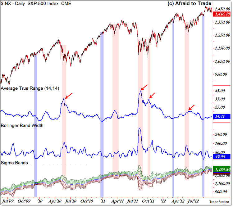
The chart above shows the Daily S&P 500 with the following price-based volatility indicators:
ATR (Average True Range) which measures the daily high-low range,
Bollinger Band Width which measures the distance between the top and bottom standard Bollinger Band,
Sigma Bands which graphically show four standard deviations above and beneath the 20 period average (‘extra’ Bollinger Bands).
For reference, the current Daily ATR value is 14.41 which is on an up-swing from the 9.46 level last seen on August 23.
I highlighted prior periods of low ATR values, ALL of which had one more burst of upside action before a short-term reversal (lower) occurred.
That’s likely what we’re seeing currently – another upswing in price ahead of a potential sell-off phase (deeper retracement).
The Bollinger Band Width indicator registers at 49.08 which also is up from the August 23 low of 21.64.
Keep in mind this simply shows the distance between the upper and lower Bollinger Band indicator (two standard deviations above the 20 day average).
The BB-Width Indicator tends to be a little more stable than the more popular ATR indicator as seen from the historical range.
Finally, the Sigma Band indicator simply plots more Bollinger Bands; it adds all four standard deviation bands above and beneath the average (not just two standard deviations above and beneath).
According to the Volatility Principle, price tends to alternate between periods of high and low volatility – compressions or low-volatile periods tend to give way to future price expansions/breakouts.
You can see the historical development and the outcome of each of prior low and high volatility periods in the chart above.
The pattern seems to be that periods of low volatility (price compression/consolidation) tend to lead to one final ‘burst’ higher (January 2010; January 2011; March 2012; and now September 2012) ahead of a marginal retracement or decline in prices (the red periods on the chart).
If history does repeat, then we may see at least a marginal price weakness/decline in the near future.
Corey Rosenbloom, CMT
Afraid to Trade.com
Follow Corey on Twitter: http://twitter.com/afraidtotrade
Corey’s new book The Complete Trading Course (Wiley Finance) is now available!

I think it is strange with all that nervousnes and danger in the markets that the vix is so low ! if you look internationaley ( economist ) that is a bit strange, are the Amerikans sleeping ? or is there sumeting else going on (manipulation perhaps?)
Regards Johan Wagenaar http://www.facebook.com/stocktip4you