Weekly Quad Index Perspective at New Highs
A lot of us intraday traders hyper-focus on the intraday charts and might come to one conclusion, but if we pull the perspective back to the higher timeframes, we might have an “A-ha” moment and see the broader picture that the intraday charts can’t reveal.
Namely, the Russell 2000 just touched all-time highs, the NASDAQ 100 recently broke above its 2007 “Bear Market” high, and the actual NASDAQ is mere points away from breaking through its 2007 peak.
The S&P 500 and Dow Jones, however, are lagging the other smaller-cap indexes and are points away from 3-year highs not seen since mid-2008 – well below the 2007 peak.
Here – charts show the whole picture better than words can.
Let’s start with the most bullish Russell 2000:
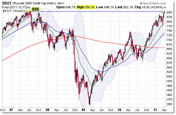
The Small-Cap index can lead the “Blue Chip” indexes, as was the case with the peak in July 2007 ahead of the final stock market peak in October 2007.
Today and yesterday, the Russell broke to new lifetime highs – although by the smallest of margins on an overextended price rally.
The NASDAQ-100 Index has also broken to new recovery highs – though the ‘situation’ in 2000 (Tech Bubble Boom and Bust) will leave the NASDAQ far away from new lifetime highs for years to come.
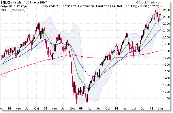
We actually had a breakout to new recovery highs above 2007’s October peak in January 2011, and the current rally has not taken us up to new heights above 2,400.
Now we turn to our old friend the broader NASDAQ Index:
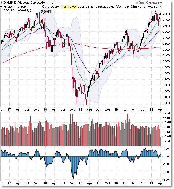
The October 2007 high was 2,861 and this week’s high was 2,815 which is just shy of the 2011 ‘new recovery high’ at 2,840.
One more good push takes us to index highs above 2007 not seen since late 2000. Recall the ultimate NASDAQ peak in early 2000 was just above 5,100. That won’t be happening again for years (it’s a little less than an index doubling from here).
And finally we turn to the two “Blue Chip” large cap indexes, starting with the Dow Jones:
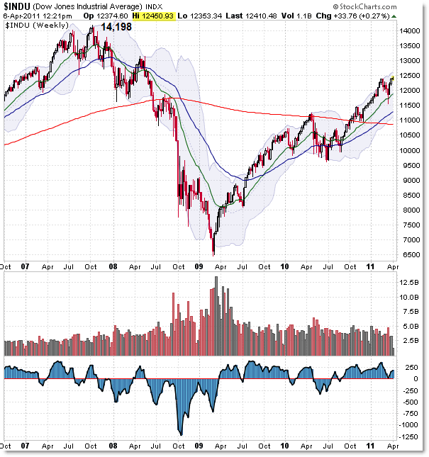
This week, the Dow pushed to a marginal (weak) new recovery high above 14,000 not seen since May/June 2008.
Yes, volume is pathetic but we’re picking up on low volume across the board – not the picture of bullish strength you would expect at new recovery highs but it’s part of the bullish landscape we have at the moment.
Finally, the S&P 500 is close, but not yet at new recovery highs beyond 1,344.
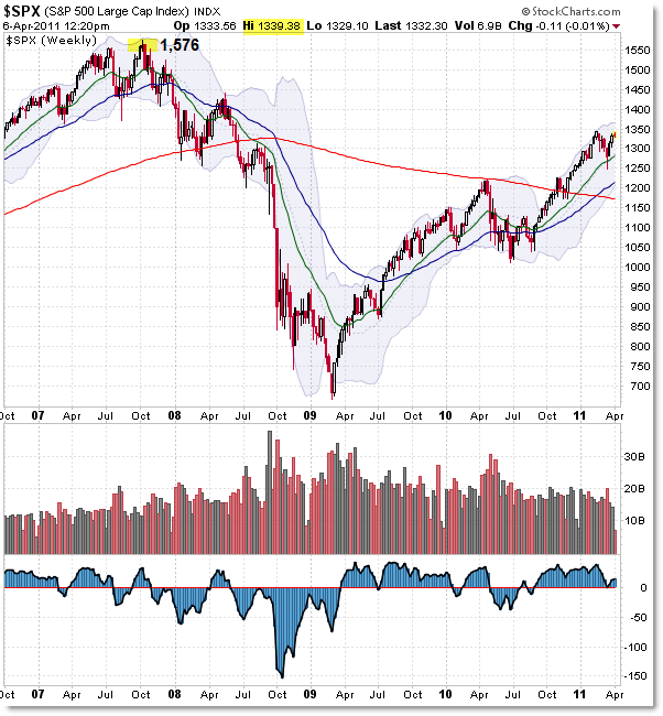
The S&P 500 and Dow Jones indexes are closest correlated in structure, just like the NASDAQ and Russell are correlated similarly.
S&P 500 volume has fallen off a cliff in 2011 but that – so far – has not stopped the rally into resistance which now threatens to break the resistance to new recovery highs.
So what’s the overall picture?
Yes, the lower frame charts – daily and intraday – show massive divergences particularly in volume which leads one to believe this rally will fail at the current resistance levels.
The higher frame charts – if you ignore the signals from volume – send a message of positive bullish strength that has persisted almost unchecked – save the “Flash Crash” period of mid-2010 – from the March 2009 low.
Yes, QE1 and QE2 are largely responsible for helping to push stock prices higher in both cases, but that’s a whole other debate for another day.
The intermediate term trends all remain up, and in the example of the NASDAQ and Russell, the trends have broken to new lifetime or new recovery highs beyond 2007.
Keep the larger perspective in mind and do not ignore the significance of markets that sneak or creep their way to new lifetime/recovery highs – you’ll miss these realities if you spend your time focused only on the intraday charts and the bearish/caution signals that currently appear there.
Corey Rosenbloom, CMT
Afraid to Trade.com
Follow Corey on Twitter: http://twitter.com/afraidtotrade
Corey’s new book The Complete Trading Course (Wiley Finance) is now available!

3 Comments
Comments are closed.