Weekly Silver SLV Structure and Daily Arc Levels to Watch
Silver is forming a multi-timeframe arc pattern that’s worth watching, as well as key support levels also across the two major timeframes.
Let’s start with Silver’s weekly structure chart, note levels to watch, and then move to the daily chart of SLV for similar arcs and levels to know.
Silver Futures Contracts – continuous – weekly:
Silver peaked at the $21 level in early 2008 just after the stock market did in October 2007.
From there, price fell to a 2008 ‘bear market’ low of $9 per ounce, and then doubled in price through the 2009 recovery year to peak recently at $20.00 per ounce.
Along the way, the price structure formed a rounded arc pattern I have drawn above with the upper arc trendline currently at the $19.50 area. Keep that level in mind as you study the rest of the chart.
I drew a horizontal price support line from the $19.00 level, which also comes into play as overhead potential resistance – along with the arc.
Finally – we see a rising trendline of support that ends at the $16.50 level, though the rising 50 week EMA rests currently at $17.00.
Simply stated, watch $16.50 and $17.00 for potential support on any down move.
Unfortunately for silver bulls, the 3/10 Oscillator shows a clear multi-swing negative momentum divergence has formed as price completed the recent arc formation – a common development when price forms arcs.
Negative momentum divergences are non-confirmations of recent price highs and serve as warning signs to monitor bullish positions closely and expect a potential reversal in price as a potential outcome ahead.
Keep all those factors in mind when studying silver’s chart.
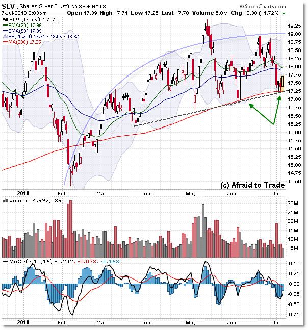
Now, let’s drop to the daily chart for more specific levels to watch, but this time on the tradeable ETF SLV:

Prices are similar – but not exactly identical – to the continuous futures contract, so depending on what you trade, watch those levels.
We see a smaller arc formation completing the peak on the daily chart, also at the $19.00 per share level, which is similar to the larger-scale weekly chart arc.
Resistance thus exists at the $19.00 per share level, and any break above that would change the structure.
Until that happens, look for lower support levels to come into play, like the bounce we’re seeing today off the rising 200 day SMA at $17.25, which also intersects with a rising trendline as drawn.
The moving averages – currently at the $18.00 level – have been insignificant recently, so on any bounce, we could see a move right through this level.
The $19 level is still formidable resistance, just as the $17 level is formidable support.
From a short term perspective, expect SLV to trade within the confines of this range unless we see an unexpected break to the upside above $19.00, or otherwise be prepared to trade the potential – and perhaps more likely given the chart data now – break under $17.00 per share.
Corey Rosenbloom, CMT
Afraid to Trade.com
Follow Corey on Twitter: http://twitter.com/afraidtotrade


Nice write up Corey… I like ZSL for playing the short side of silver…
Chart of silvier, SLV, shows that it is in the middle of a broadening top pattern, and would be a sell; but then again it might be an ivestment metal worth holding onto. Chart shows that it could easily fall to 16; if it is an investment metal, it will rise higher with gold when gold goes on much, much higher.
Some consistenly over the years have complained of price manipulation in silver; and they have continually said there is not enough and will not be enough stock in the trading warehouse to meet physical demand once breaks out; so we could see it trading higher when gold moves up.
Looks like a bull trap. Once we break through the 200, let the landslide begin. Money is mad faster on the down side than the upside.