Average Volume and Rallies in the SP500 for October
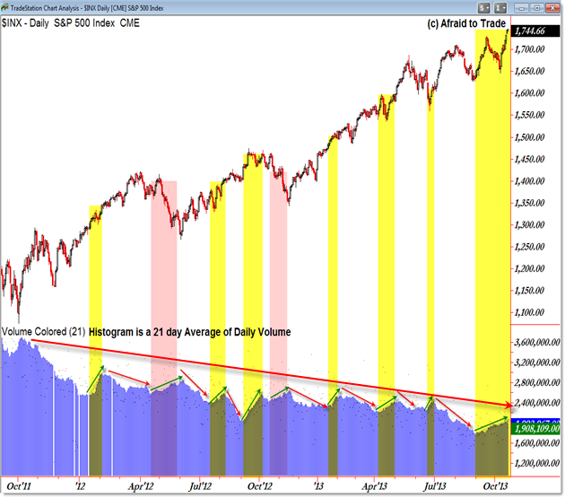
With the recent breakout to new highs, the market is experiencing above average volume during the upswing which serves as a confirmation of the rally in motion.
Let’s take a look at other phases during the broader S&P 500 market rally for similar periods of increasing volume during bullish phases.

The chart above – created in TradeStation – shows the S&P 500 Daily Chart along with the 21 day average daily volume presented as a blue histogram indicator.
In other words, each bar is not the volume for that day, but instead the rolling 21 day average volume over time.
At first glance, we see a strong market rally caught in a larger picture of steadily declining average volume.
While that’s true, the relative volume hasn’t yet hampered the rally and shouldn’t be taken as a de facto sign of impending trend reversal.
What I wanted to highlight instead was the periods where the average volume indicator was rising relative to the S&P 500 itself.
I drew red and green arrows during “swings” or phases in the market where the 21 day average volume line was either rising or falling.
Where the average volume line rises with price (both are rising together), I highlighted these phases yellow as a sign of confirmation of the bull market uptrend in motion (since March 2009).
There are only two main periods on the chart above where the average volume line rose while price declined in a retracement against the prevailing or dominant uptrend. Arguably the July 2013 period may also be seen as another decline or retracement period also.
The current upswing in average volume, starting in early September, is the longest phase of rising price with rising volume as seen on the chart (starting with October 2011’s inflection low).
Despite the lengthy divergence which has been developing from the March 2009 low, the recent September to late October rally occurred on higher than average volume and may further be a sign of confirmation of the prevailing uptrend.
The chart provides a historical reference for which to place phases of market movement relative to volume over time.
I’ll be discussing breakout, retracement, and reversal trading tactics live at the Las Vegas Traders Expo on November 22 – join me and your fellow traders at the free expo!
Corey Rosenbloom, CMT
Afraid to Trade.com
Follow Corey on Twitter: http://twitter.com/afraidtotrade
Corey’s new book The Complete Trading Course (Wiley Finance) is now available along with the newly released Profiting from the Life Cycle of a Stock Trend presentation (also from Wiley).
