SP500 Again Riding the Sigma Bands in August
There’s an interesting chart phenomenon I’ve covered in the past and the S&P 500 is currently repeating the pattern.
Let’s take a look at the updated Sigma Band (Bollinger Band) chart for the S&P 500 and take a look at two recent examples of a similar pattern to monitor.
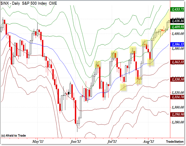
Here’s the current S&P 500:

What we’re seeing is the S&P 500 Daily Chart with Sigma Bands overlaid.
A Sigma Band is just a Standard Deviation Band above and beneath the 20 day average or mean.
The popular Bollinger Band shows 2 Standard Deviations above and beneath the mean; in contrast, the Sigma Band chart expands this to all SDev Bands from 1 to 4 plotted above and beneath the blue 20 day moving average (or mean).
In the current environment (from mid-June to present), price has been reversing short-term at the 2 SD level for resistance and supporting at the 1 SD level for support – all of which are highlighted.
That pattern changed with a support off the 20d SMA in early August and the new pattern has emerged which we continue to monitor: Price is trading (or riding) between the +1 SD and +2 SD Band.
At the moment, the Bands are wide with 24 points separating each Band. Standard Deviation increases and decreases as price becomes more or less volatile in a period.
The current levels to monitor are 1,409 (+1 SD) and 1,433 (+2 SD) and also 1,386 (20d SMA should the pattern fail).
You can create your own Sigma or Standard Deviation Band chart by expanding your standard Bollinger Band chart to reveal more Standard Deviation levels (again, the chart above shows the first four levels above and beneath the 20 day moving average).
We’ve seen this pattern before as I’ve highlighted in previous updates, and let’s take a quick look at prior charts of price “riding” between the +1 and +2 SD Levels:

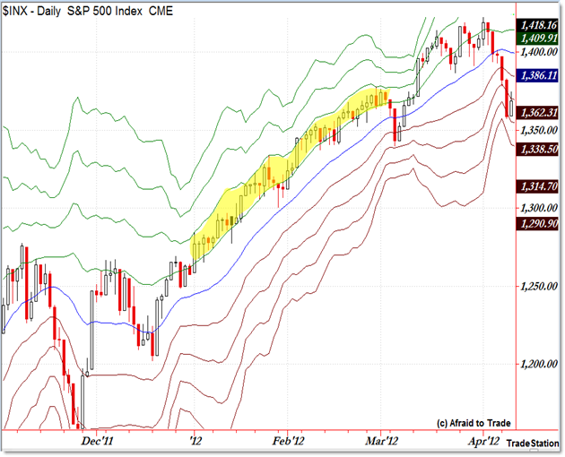
Earlier in 2012, from January to late February, price ‘rode’ between these bands as shown in the highlighted region.
Price supported once off the 20d SMA (blue) in late January only to continue the pattern all the way through February.
Notice how the Sigma or Standard Deviation Bands compressed in early March which reflected the low-volatility creep at the beginning of the year.
The prior example was very similar and it occurred from December 2010 to mid-February 2011:

Once again, with a mid-pattern support bounce off the 20 day SMA in late January, price continued throughout February before reversing with a sell-off phase into March 2011.
Although I didn’t show the charts, you can study two other recent instances of this pattern:
Early September 2010 through early November 2010
Early March 2010 to late April 2010
For reference updates (and commentary) as these patterns happened, here are prior blog update links:
“Updating the SP500 Sigma Bands for March 2012”
“A Lesson on Silver, Stability, and Sigma Bands”
“SP500 Continues to Ride Sigma Bands Higher” February 2011
“Gold Also Rides Between Two Sigma Bands” October 2010
“Chart of SP500 Trading Between Two Sigma Bands” October 2010
Corey Rosenbloom, CMT
Afraid to Trade.com
Follow Corey on Twitter: http://twitter.com/afraidtotrade
Corey’s new book The Complete Trading Course (Wiley Finance) is now available!
