Updating Breadth by Tracking Stocks above Moving Averages
One of the lesser-known ways to measure breadth -broader stock participation in market rallies or declines – is to compare the percentage of stocks trading above certain moving averages to get a peek inside the health (or weakness) of a market rally in motion.
Let’s create a new “Breadth” Chart using a key indicator that quickly shows broader participation – or lack thereof – in a market trend.
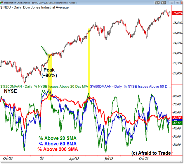
Here’s the Dow Jones with the broader NYSE Indicator:

A quick explanation of our custom indicator:
We see the Dow Jones Industrial Average compared to three indicator lines which reveal the percentage of stocks above the 20 (green), 50 (blue) and 200 (red) day simple moving average.
These are system generated indexes in TradeStation ($%20DMAAN for percentage stocks above their 20 day SMA for example) and can be overlaid like indicators.
It’s helpful to compare the 20 (short-term), 50 (intermediate), and 200 day (longer term) percentages for a broader picture than can be revealed by a single indicator.
What we see is the composite chart of these three metrics.
The indicators peaked in January 2013 with over 80% of issues in the NYSE trading above their 20, 50, and 200 day SMA. We often see such signs of strength – high readings – at the START of a new uptrend or bull market rally (contrary to popular belief where an ‘overbought’ reading signals a top).
From there, price has indeed trended higher but fewer and fewer issues have remained above their 200 day SMA (red) despite volatility in the 20 and 50 day indicator (green and blue).
In fact, we saw a similar “sign of strength” in May 2013 and another recently in October – both of which preceded rallies.
It’s troublesome to see fewer and fewer issues trade above their respective moving averages, but put current readings in the context of all of 2013.
With the US Equity Indexes at all-time highs (except the NASDAQ), roughly 54% of NYSE Issues trade above their 200 day SMA.
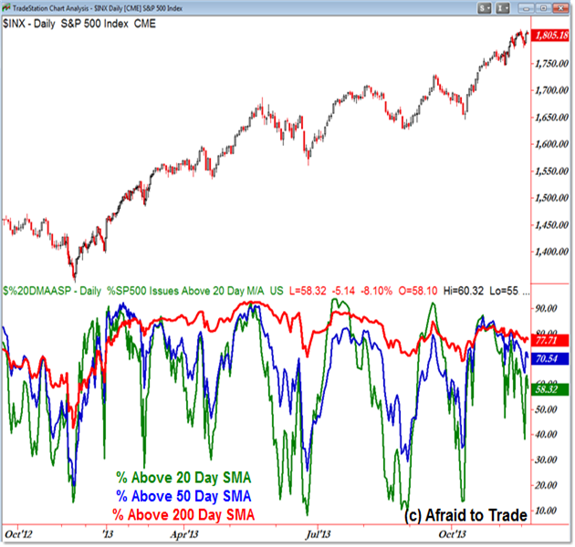
Here’s the same picture with the S&P 500-specific stocks:

The S&P 500 “moving average breadth” indicators peaked similarly in May 2013, and surprisingly fewer stocks have remained above their 200 day simple moving averages from this mid-year peak.
That’s not to say everything has fallen apart; in fact, 77% of stocks in the S&P 500 do indeed trade above their 200 day SMA. This is down from the mid-year peak at 92%, however.
In general – and with almost any sort of breadth indicator – you would expect to see the strongest reading at the start of an uptrend and the readings trail off over time as the trend matures (and eventually reverses on lengthy divergences).
While we’re certainly not seeing reversal signals in price yet, breadth (at least as measured by collective stocks above their moving averages) does send a cautious sign.
Follow along with members of the Daily Commentary and Idealized Trades summaries for real-time updates and additional trade planning parameters as we watch a “hold and bounce” or “break and retrace” scenario play out in the near future.
Corey Rosenbloom, CMT
Afraid to Trade.com
Follow Corey on Twitter: http://twitter.com/afraidtotrade
Corey’s new book The Complete Trading Course (Wiley Finance) is now available along with the newly released Profiting from the Life Cycle of a Stock Trend presentation (also from Wiley).

