2010 Intermarket Relationship Charts with the SP500
As promised, I wanted to follow-up the prior “Market Performance in 2010” post with a few charts of the major cross-markets and the developing relationship with the S&P 500.
In looking at the reference charts, pay close attention first to the type of relationship – positive or negative – and the periods of time (highlighted) where the traditional relationship broke-down temporarily – and then resumed its normal course.
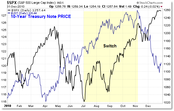
First, let’s start with the S&P 500 and 10-year Treasury Note Prices:

As a reference, the S&P 500 will be the black line in all charts, and will be scaled on the right.
In recent history, Treasury prices are INVERSE stock prices, which is logical.
The Bond and Stock Markets COMPETE for investor capital, and investors tend to invest in bonds when playing “risk off” or conservative, and invest in stocks when playing “risk on” and offensive.
This strong inverse relationship proved true with the exception of the highlighted period from July to November when both markets rose together. That was in part due to the Federal Reserve’s QE2 plan and the “advance” positioning ahead of the official announcement.
The relationship returned to normal in November as bonds fell and stocks continued their rise – and the relationship remains ‘normal’ today.
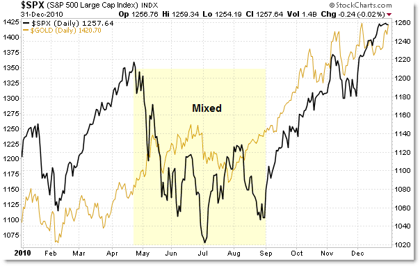
The S&P 500 and Gold Prices:

In general, stocks and gold prices have been positively correlated, but for the most part gold rose all year long with only a medium pullback in July – about the same time stocks pulled back.
However, you can see that stocks fell from May to July and gold rose – so the relationship is weakly positively correlated. Gold – along with stocks – benefited at the end of the year due to the QE2 rumors and facts from the Federal Reserve.
The relationship remains positively correlated as we start 2011.
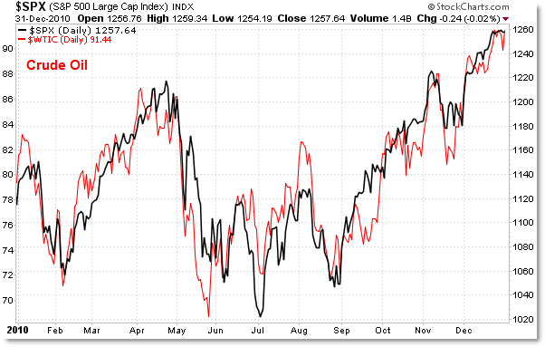
The S&P 500 and Crude Oil (red):

Of all the major cross-markets, the MOST positively correlated markets are stocks and crude oil – at least in 2010.
Virtually every single turn stocks made, crude oil made it right along-side the S&P 500.
Both markets share similar fates in terms of global economic prospects, and both benefited at the end of the year due to the QE2 activities.
It would be surprising if this relationship broke down soon – it was the strongest in 2010.
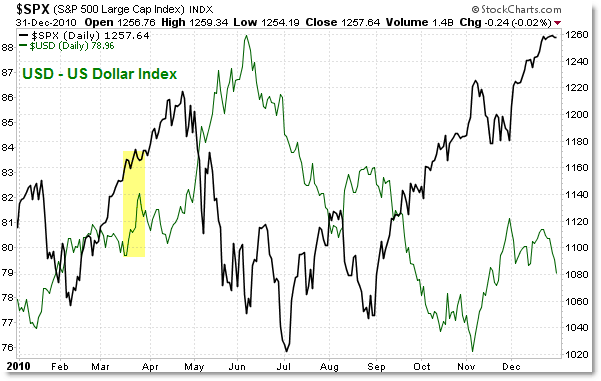
The S&P 500 and the US Dollar Index:

Investors traditionally view the US Dollar Index and the S&P 500 as strongly inversely correlated, and that was very correct in 2010.
The relationship remains strongly inversely correlated (when one moves up, the other moves down), though there were brief periods in 2010 where the relationship was not perfectly inversely correlated.
This logically places the US Dollar Index roughly positively correlated with Treasury Bond/Note prices, and of course also inversely correlated with Gold and Crude Oil.
I discuss these relationships – and current opportunities/price levels to monitor currently and in the weeks ahead – in the member Inter-market Report each weekend.
Keep these charts as a reference and learn how markets relate and what to expect from one market to the next – and be aware when the traditional relationships break-down temporarily so you can manage risk appropriately.
Corey Rosenbloom, CMT
Afraid to Trade.com
Follow Corey on Twitter: http://twitter.com/afraidtotrade

Excellent, Corey! these are the correlations to observe going into the new year here. Speaking of correlations. the Euro/S and P. Here is a great seasonal trade: Sell the Euro on Jan 5th. close trade on Feb 9th. this has been a great trade 91.7% of the time since 1999 (first full year of the euro's existence). Nice little heads up for the S and P!