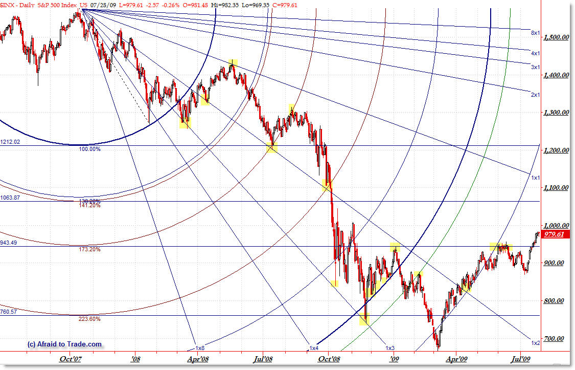
Chart Art SP500 Gann and Arcs July 28
On rare occasion, I post “Chart Art” of advanced level technical analysis methods on the S&P 500. In this updated example, I take a look at a 1 point Gann Fan angled down from the highs which is then combined with Fibonacci Arcs that radiate down also from the 2007 highs. Let’s see this chart and note key inflection points.

(Click on Image for Full-Size)
Again, the method being this ‘madness’ is taking a standard Gann Fan (available on most advanced charting platforms – this is using TradeStation) and inputing a 1 point calculation to create the resulting down-sloping lines from the high. Notice how price sometimes inflects off these fan lines as price challenges them. Nothing is ever 100%, but few traders use this tool (properly).
In conjunction with the Gann Fan, I’m drawing a Fibonacci Circle (arc) tool off the initial swing down into the mid-January 2008 lows. The resulting arcs are either Fibonacci or other important ratios of the original arc (the 100% radius).
Notice how price ‘rides’ the arcs as it interacts with the arcs.
The only other ‘strange’ method I’ve done is draw horizontal lines from the expansions (end) of each circle.
That’s as much as I want to say about this chart without revealing any proprietary methods.
The highlighted zones reflect key turning points that occurred at a level and particularly at an ‘intersection’ or node between the Fan Lines and the Arcs.
Currently, price has broken above a critical node and is in “Open Air” as revealed by this chart. This means that breaking above the 950 high was quite significant. It would be even more significant if bulls can push price beyond the 1,000 target (round-number resistance).
This also shows you a peek into the world of advanced level technical analysis which can reveal hidden insights classic models might miss… or can add a level of confirmation above and beyond classic technical methods.
Corey Rosenbloom, CMT
Afraid to Trade.com
Follow Corey on Twitter: http://twitter.com/afraidtotrade

Hi Corey,
A picture is worth a 1000 words.
Thank you for posting it.
Too bad only on rare occasion..
Would you mind commenting on the Fib Arc % values… I'm generally only keyed into the 38.2%, 50% and 61.8% levels. Seeing some very different values in this chart. Do some of these levels carry greater significance?
Thanks Lighning,
I'll try to do more but I don't want to confuse people with these.
But these are advanced methods some technicians use that can uncover hidden levels.
Thanks Bob!
Nothing's magical of course, but it's akin to Market Geometry. In addition to the standard Fibonacci ratios, I'm showing root 2, root 3, root 5, and pi.
is that the gann fan in tradestation drawing or did you mod it?