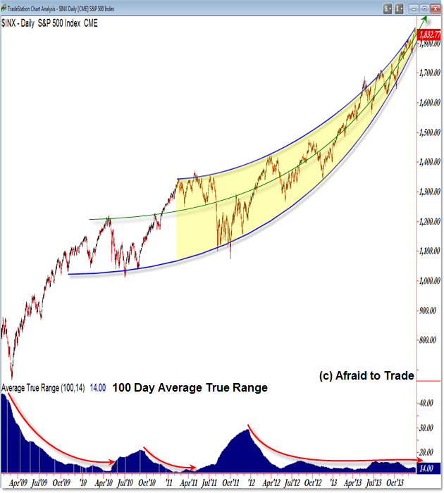
Charting the Longterm Rising Stock Market Arc Pattern from 2009
If we just view 2013 in isolation, we would say that it was a stellar year for the US Equity Market and indeed it was.
However, the picture is both fantastic and frightening if we step back to a larger perspective from 2009 to present.
We see a clear “Equity Arc” and compression in volatility that we need to study closely as we begin trading 2014, particularly if we become too complacent that equity prices will rise forever.
Let’s take a quick look at the “Equity Arc” and follow along with respect to the key trendlines:

I drew two upper and lower “arc” trendlines as highlighted and emphasized the price compression between the lines with a yellow highlight.
We can see a clear “cornucopia” pattern or “Arc” compression trendline structure.
As if that were not enough (visually alone), we see the lengthy compression in Volatility as measured with the 100 day Average True Range.
See the prior educational post “Three Quick Indicators to Measure Volatility” for additional methods of comparison.
Note the prior periods (red arc arrows) of low volatility and the “spike” in volatility (meaning sharp sell-offs) that took place after low volatility periods (complacency points).
Speaking of complacency, we’re also seeing strong inflows into equity mutual funds at the greatest pace from the 2009 bottom to present (link to affiliate EWI article “Historical Optimism in the Stock Market – What Does it Mean?“).
I would suggest comparing price with these rising (and compressing) trendline patterns and be on the look-out either for an upside acceleration towards 1,900 (which is possible) or else a potential “high volatility” period yet to come which could trigger on a clean breakdown under the lower ‘arc’ trendline near 1,800.
Follow along with members of the Daily Commentary and Idealized Trades summaries for real-time updates and additional trade planning parameters as we watch a “hold and bounce” or “break and retrace” scenario play out in the near future.
Corey Rosenbloom, CMT
Afraid to Trade.com
Follow Corey on Twitter: http://twitter.com/afraidtotrade
Corey’s new book The Complete Trading Course (Wiley Finance) is now available along with the newly released Profiting from the Life Cycle of a Stock Trend presentation (also from Wiley).


Nice look, Corey. Consider the fractal relationship this larger arc has with the mini-arc that occurred in 2013, as well. As you can see, the intra-arc moves/oscillations there are remarkably consistent with the 2009-2013 sequence.
Best wishes for 2014,
Andrew