Eerie Line Chart Similarities between 1929 and 2009
Here’s another perspective on the comparison charts of the Dow Jones between the 1929 crash and recovery and the 2009 crash and recovery.
Let’s take a quick view of the line charts of the daily Dow Jones in 1929 structure and how it compares with today’s weekly Dow Jones structure.
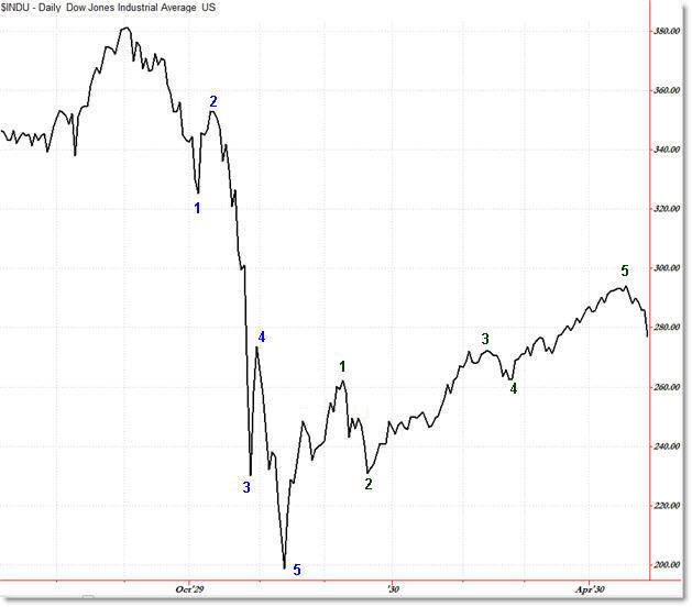
First, the Daily Dow Jones: 1929 Crash and Recovery

I drew the numbers not so much as an Elliott Wave notation, but so that comparing key swing highs and lows would be easier.
The peak to trough crash lasted 72 days as the Dow Jones fell 47% (peaking in September 1929 at 386 and falling to 195 in November 1929). It unfolded roughly in a 5-wave progression.
The rally began off the November lows and lasted 155 days, peaking up 47% at 295 during April, 1930.
This shows an important principle in investing and trading, namely that if your account (or an index) falls 50%, then it would take a full 100% rally off the lows to recapture the prior highs, and not a 50% rally off the lows as seen above.
The rally phase took twice as long as the ‘crash’ phase and also unfolded in a 5-wave affair (with smaller waves).
I found it interesting that the daily chart showed an almost identical head and shoulders reversal pattern that failed – which is similar to the June/July failed head and shoulders pattern in 2009.
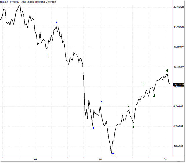
Because the 2008-2009 crash and recovery took longer, I am showing the weekly line chart of the Dow Jones.
Finally, the Current Weekly Dow Jones 2008-2009 Crash and Recovery:

Again, we see a similar 5-wave slow-crash down to the final March 2009 lows.
Price peaked in October 2008 at 14,198 and then fell 52% to the March 2009 lows of 6,469 – 72 weeks (510 days). The decline also fell in a similar 5-wave decline (with the 3rd wave ‘fractalizing’ into its own mini-five wave decline).
From the March 2009 lows, price has – so far – rallied 65% to the January high of 10,723 over the last 320 trading days… or almost all of 2009.
Again, despite the 65% rally, price is still 5,000 points lower than its 2007 peak.
The current rally also unfolded in a mini-five wave affair on a steeper angle than that of 1929, but the ‘swings’ are similar – even down to the failed head and shoulders (between green points 1 and 2).
While history certainly could repeat going forward, for now this is more along the lines of “Hmmm. That’s interesting” unless we start to see price move sharply lower to test the March lows, as was the case in 1930.
For prior updates and comparisons between 1929 and the present, see my prior updates:
Black Monday: Ancient History or Possible Future
Looking Back on the 1929 Stock Market Crash
A Look at the 1929 and 1937 Crashes and Recoveries
Corey Rosenbloom, CMT
Afraid to Trade.com
Follow Corey on Twitter: http://twitter.com/afraidtotrade

I was just thinking about this a few days ago, that I needed to look at at Great Depression versus Today's Depression graph… eerie
An interesting thought provoking post. However we need to remember that the world and the constraints that we have operate within are completely different from 1929. We live in a much more flexible world which is highly adapted to utilise talent and make profit which was not the case in the class and race ridden societies of 1929. So, for this reason and because the populations of Asia are also begining not only to accept our model but teach us a thing or two about it I am still very much a bull on this recovery. Looking ahead over the medium term I see the buffers being hit in energy supply which will slow global growth down and force to change – hence the talk about the different constraints we are operating in. I have every confidence in our (I'm UK but include the US) and the global economy to bounce out of this one but see the winds of change and slowing growth ahead over the 3-5 year timeframe.
It’s important to be afraid of any farther crash,very relevant information.
Good observations and great post! This depression is tracking 1929 very closely. The only difference this time around is FED's intervention. This is causing slowness of the trajectory. This will be a slow motion repetition of 1929, everything is happening roughly in twice the time frame of 1929. The market took 2.5 years to bottom out from 1930's suckers rally peak. This time it will take 5 years to bottom, around 2015. DOW will hit 1500-2000 range by then. So much for the FED's actions. We may not see 10K for DOW in 30-40 years.
Good observations and great post! This depression is tracking 1929 very closely. The only difference this time around is FED's intervention. This is causing slowness of the trajectory. This will be a slow motion repetition of 1929, everything is happening roughly in twice the time frame of 1929. The market took 2.5 years to bottom out from 1930's suckers rally peak. This time it will take 5 years to bottom, around 2015. DOW will hit 1500-2000 range by then. So much for the FED's actions. We may not see 10K for DOW in 30-40 years.