Interesting Chart of Breakout Structure of Dow and SP500
With the Dow Jones and SP500 both breaking – and closing – at record all time highs, let’s take a quick look at intraday structure, trendlines, and factors to watch going forward.
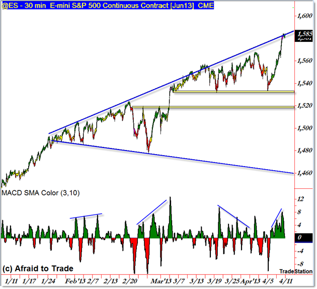
We’ll start with the SP500 (@ES Futures) which generated more headlines today than yet another record close in the Dow Jones Index:

You’ve probably heard it discussed before, but believe it or not the SP500 continues to trade within a broadening trendline formation that began with the February compression swings.
The market has traded against the rising upper trendline, almost as if pulled up there like a magnet.
Nevertheless, it continues to be one of the dominant short-term focal points for the market (price closed again into the upper rising trendline).
When we discuss Market Structure, we refer to the progression of swing highs and swing lows along with any visual trendlines that can be drawn. Structure may also refer to the distance or length of each swing relative to similar pro-trend or counter-trend (retracement) swings.
Clearly, structure remains in an uptrend and that process has been uninterrupted since the November 2012 low, though late February and early March showed steep pullbacks or counter-trend retracements.
Before we start calling a logical top, draw your attention to the periods where price rallied into the upper rising trendline… and stayed there for days on end.
Examples would include mid-February and early March – note how price spiked violently higher to continue the ‘riding’ of the upper trendline. It’s possible – though of course not guaranteed – that we see a similar pro-trend continuation phase temporarily.
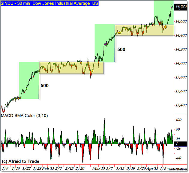
The Dow Jones doesn’t show a clear ‘broadening trendline’ pattern, but is best described through rectangle breakouts:

The yellow highlighted regions represent compression zones or “Rectangle” patterns as pauses during the persistent short-term uptrend structure.
Both recent sideways periods lasted for a full month (roughly 29 days in the February pattern and 27 days in the recent March pattern) the prior expansion or trend/impulse swings moved roughly 500 index points.
If history repeats with the current breakout, then a simple upside “500 point” target exists near the round number 15,000 level.
Like the SP500, you could also draw a rising trendline to connect the price swing highs (structure) of the movement but the picture is not as clear as the SP500 due to the lengthier rectangle patterns seen in the Dow Jones.
Continue to watch short-term structure (intraday) as it develops in real time relative to these key levels and the potential for price to ‘ride the rails’ of the rising upper trendlines (there is no requirement, logical as it may be, for price to fall sharply from a test of a trendline).
Follow along with daily commentary and detailed analysis each evening by joining our membership services for your choice of daily or weekly commentary, education, and analysis.
Corey Rosenbloom, CMT
Afraid to Trade.com
Follow Corey on Twitter: http://twitter.com/afraidtotrade
Corey’s new book The Complete Trading Course (Wiley Finance) is now available

it is no doubt we are in a bull market, check out this awesome graphic
as it exposes where we are in the bull market right now
http://sentiment-trader.blogsp…
I did not know but a bull market has 6 special stages, and where we are right now might surprise you.