Multiple Timeframe Color Ribbon Chart Update for SP500 Gold and Crude Oil
Often it’s helpful to step back and focus on the trend and build strategies accordingly.
Let’s take a moment to focus on special “Color Ribbon” Charts for three leading markets and highlight their Trend Structure together.
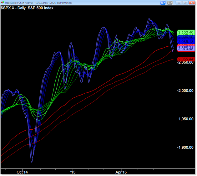
We’ll start our journey with the S&P 500 Color Ribbon Multi-timeframe chart:

Let’s start with what we’re seeing and exactly why it’s important.
The “Color Ribbon” Chart displays multiple moving averages to get a sense of the trend on three timeframes.
- The Blue Ribbons represent the Short-Term Trend;
- The Green Ribbons reflect the Intermediate Trend;
- and the three Red Ribbons highlight the longer term or Primary Trend.
These charts simply provide a rapid way to assess all three trends at once without doubt or confusion.
For example, starting with the Primary Trend, stocks prices are trending higher.
The same is true with the Intermediate Trend but we’re seeing another round of Sideways action in the green averages as well as bearish or negative cross-unders.
We’ll keep our attention here (the intermediate sideways potential roll-over) for the moment.
The Short-Term trend continues to show a bullish trending pattern of higher highs and higher lows… except for the most recent lower high and lower low.
These are caution signs but we’ll note again that price – so far – stabilized and bounced off the 200 day SMA which we can see reflected here in the Ribbon Chart.
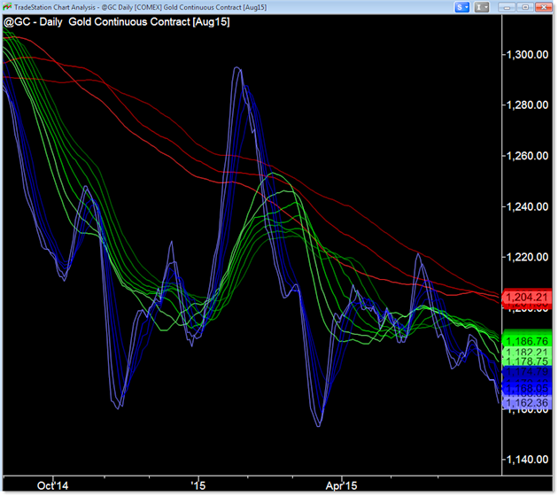
The same logic applies to our downtrending chart of Gold prices (@GC Futures):

This time we’re seeing the exact opposite picture of the US Stock Market (S&P 500).
Gold’s Primary (Red) Trend is down but stabilizing at the $1,200 level;
its Intermediate Trend recently stabilized but is expanding lower in a bearish slide;
and the Short Term Trend just broke to new lows as the downtrend continued (instead of reversing recently).
Keep in mind that we are NOT showing price on our charts – just the averages and their location.
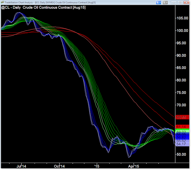
Finally, let’s see the fascinating plunge experienced in Crude Oil (@CL Futures):

For a commodity, that is a huge plunge in 2014. Note the Ribbon Picture above.
Still, price stabilized at the $50.00 level, bouncing up away from this level to peak into the underside of the falling Primary Trend averages.
Recently, we’re seeing a swing down to continue the trend in Crude Oil.
These charts are meant to help you assess how the multiple timeframe trends are working together and thus how to position into these trending markets.
Corey Rosenbloom, CMT
Afraid to Trade.com
Follow Corey on Twitter: http://twitter.com/afraidtotrade
Corey’s book The Complete Trading Course (Wiley Finance) is now available along with the newly released Profiting from the Life Cycle of a Stock Trend presentation (also from Wiley).

One Comment
Comments are closed.