Use this Reference Chart to Make Sense of Current SPX Range
We’ve all been hearing conflicting analysis as to whether the market will “certainly” be going up or down in the near future, but the reality is that the market is caught in a “year to date” tug-of-war between buyers and sellers which has given us clear reference areas to monitor.
Let’s cut through all the smoke and focus on the clear reference areas – with regard to current “Value” – that define the current “Range” Stock Market Structure.
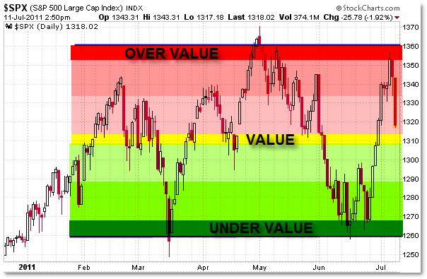
First, let’s look at the current chart:

In simplest terms, the market is pausing or consolidating in a large Rectangle Pattern at the moment.
The lower “Support” trendline rests at 1,260 while the upper “Resistance” trendline sits at 1,350.
The Midpoint of the Rectangle thus falls at the 1,310 area.
Those are the cleanest reference prices to assess current market structure.
Since February 2011, we neither have an Uptrend nor a Downtrend – the official structural definition is thus:
The market is in a short (to intermediate) term consolidation/pause (sideways trend) in the context of a clear intermediate (to long-term) rising uptrend (starting with March 2009).
If we strip all the indicators off the chart and look simply at price, we can envision the following reference:

In terms of Price/Auction Theory, the market treats 1,310 as a “Value” area of balance between buyers and sellers.
The market treats a move to 1,350/1,360 as “Over-Valued” and thus price “is rejected” at the upper boundary, resulting in a downward path towards, and then beneath, value.
Thus, the market treats a move down to 1,250/1,260 as “Under-Valued” and similarly is “rejected,” which results in an upward path back to – and then above – Value.
In this way, buyers and sellers (on a larger scale) are questing to find value, and their larger actions in aggregate help determine and reinforce these reference areas.
While these levels are not permanent, they are the current reference boundaries that the market has respected for the better part of 2011.
Once this grid itself – the Consolidation/Equilibrium – is rejected, then buyers and sellers will ‘quest’ higher or lower to establish a new equilibrium, which most likely will result in a Breakout or Breakaway trend move under 1,250 (targeting 1,200 or lower) or above 1,360 (targeting 1,400 or even 1,440).
Remember, breakouts from Equilibrium (really on any timeframe) tend to ignite “Feedback Loops” where one side of the market is squeezed (forced to cover) as the other side dominates (adds to existing positions or puts on new positions in the direction of the break).
Until we get that breakout, these are the upper, middle, and lower reference areas buyers and sellers (the ‘market’) have accepted in terms of current market structure.
Use these for short-term trading/planning decisions.
Corey Rosenbloom, CMT
Afraid to Trade.com
Follow Corey on Twitter: http://twitter.com/afraidtotrade
Corey’s new book The Complete Trading Course (Wiley Finance) is now available!

Great Post as usual Corey!
Why are you not showing an island reversal from last week on your chart?
GREAT perspective post – THANKS!
-D
This is what I am talking about: $SPY Does this Island reversal break the yellow trendline and fall to the breakout of last week around $129.50? http://fsc.bz/FTz
Thanks Ryan! Hope all is well.
StockCharts SP500 Index data isn't showing the two recent downside gaps that occurred unlike the SPY ETF.
I think that here is a whole SHS Complex…..
http://phantonomics.blogspot.c…
It's a hell of a range +10%…
check a weekly chart with a long moving average and you will see that 1300 zone it's not where “buyers & sellers” meet value, thus where THE MACHINE can't widden the volatility spreads, buyers & sellers ( real people) are in those 2 bounds you pointed out, in between are those alpha seekers wiz kids with their algorithms.
Sorry the spelling, I'm too drunk.
Cheers fantasma
india nifty count please, its been a while