Watching the Stock and Commodity Relationship Break Down
If you use any sort of inter-market or cross-market analysis in your trading, you’re probably aware that the traditionally positive relationship between stocks and commodities have broken down through most of 2013.
Let’s take a look at this relationship, how it’s been strong, and how it’s broken sharply over the last few months (reminding us that cross-market relationships are never 100% guaranteed).

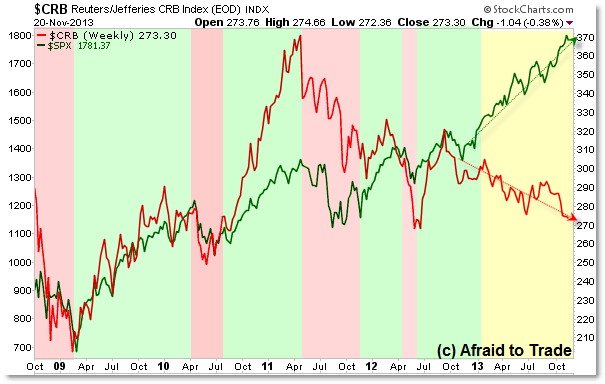
Let’s go through this chart step by step.
First, I color coded the up/bullish (rally) and down/bearish (decline) periods when BOTH stocks and commodities (as represented by the broader Reuters/Jefferies CRB Index) traded in the same direction at roughly the same time.
With the exception of mid-2011, stocks and commodities have been trading in an ongoing uptrend… or at least stocks have been in a primary uptrend.
I segmented the stronger rally for commodities in 2010 (relative strength) with a similar strong decline during 2011 (relative weakness) – be sure to take this into account when comparing the Red (CRB) and Green (S&P 500) lines.
We’re interested in periods where stocks and commodities traded together (both rising or both falling) at roughly the same time – not necessarily the magnitude.
With that being said, we note the entirety of 2013 which has seen a steady and ongoing uptrend (nothing new) in the S&P 500 but a new and surprising downtrend that has become clear in commodities (CRB Index).
I highlighted this key period yellow and it continues to this day.
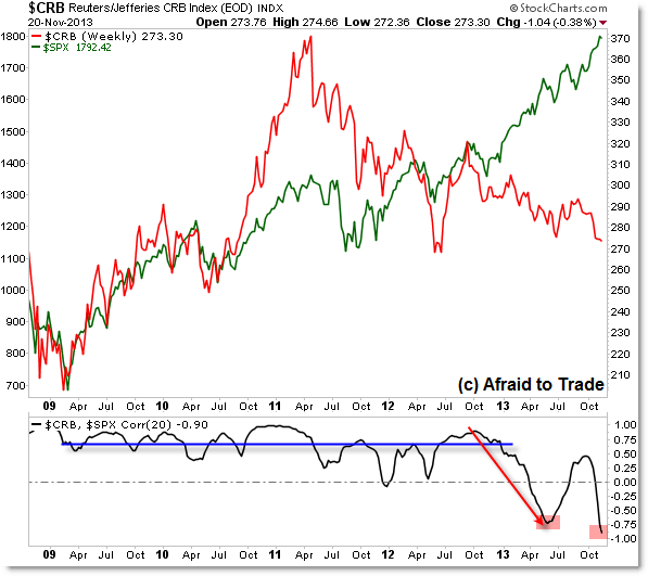
In fact, we can view the bending and now breaking of the relationship through a correlation chart:

We’re seeing the same chart (CRB Red – scaled on the right side; S&P 500 Green – scaled on the left side) without color indications and this time with a 20 day rolling Correlation (StockCharts).
As would widely be expected, we saw a high correlation coefficient with an average value near +0.75 (sometimes closer to +0.90, sometimes closer to +0.50) which represents a strong positive correlation. When one market rose, the other rose similarly.
However, January 2013 (and really back to October 2012) saw the peak and steady decline in the 20 day rolling correlation down to a -0.75 in May/June 2013 which quickly rebounded but collapsed back to -0.90 which represents a strongly negatively correlated value. When stocks rose, commodities fell over the same period.
Looking back, we can now see that Commodities actually peaked in April 2011 and have never traded near their high. Stocks, however, peaked similarly in April/May 2011 but have made many new highs in an ongoing uptrend.
Again, continue to follow this ‘broken’ relationship for any changes in the future.
Follow along week-by-week with us by becoming a member of the Weekly Intermarket Game-Planning and analysis where we continue to study ongoing trading/position opportunities not just for Stocks and Commodities, but also US Treasuries, Gold, Crude Oil, and the US Dollar Index.
Corey Rosenbloom, CMT
Afraid to Trade.com
Follow Corey on Twitter: http://twitter.com/afraidtotrade
Corey’s new book The Complete Trading Course (Wiley Finance) is now available along with the newly released Profiting from the Life Cycle of a Stock Trend presentation (also from Wiley).

No doubt that the sentiment is very bullish. After all there is no where else for all those trillions of dollars that the FED is printing to go. That is what is underpinning the sentiment see: http://www.ivtrades.com/the-st… I remember in the Fall of 2007 when MariaBartiromo was on the CNBCClosingBell celebrating DOW 14000…then 2008 happened