Bullish Signs from the March 2012 Sector Rotation Model
What is the broader Sector Rotation Model saying about the current rally and state of the market?
Good things actually.
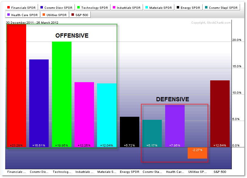
Let’s take a moment to view the current Sector Rotation Performance from three perspectives, starting with Absolute Performance so far in 2012:

To recap, the Sector Rotation Model breaks down the broader market into nine sectors as represented above with the tradable AMEX Sector SPDRs (XLK for Technology for example).
These nine sectors are divided into two broad categories:
- Offensive/Aggressive Sectors (tend to outperform in a Bull/Rally mode)
- Defensive/Conservative Sectors (tend to outperform in a Bear/Decline mode)
By assessing which sectors are outperforming, a trader or investor can get a sense of the broader stock market and economy.
In addition, savvy traders can scan to locate the strongest relative stocks in the strongest relative sectors for short-term trading opportunities (go with the winners!).
Ok, so what is the Model saying?
This is the picture of Bullish Strength – mainly in terms of the strong outperformance (greatest percentage increase in 2012) coming from the aggressive/offensive sectors of Financials (XLF), Technology (XLK), and Consumer Discretionary/Retail (XLY).
By the same token, the weakest sector performance comes from the Defensive sectors of Consumer Staples (XLP), Health Care (XLP) and a slight negative return (down 2.3%) for Utilities (XLU).
Energy – despite the headlines – is also an underperformer at 5.7%.
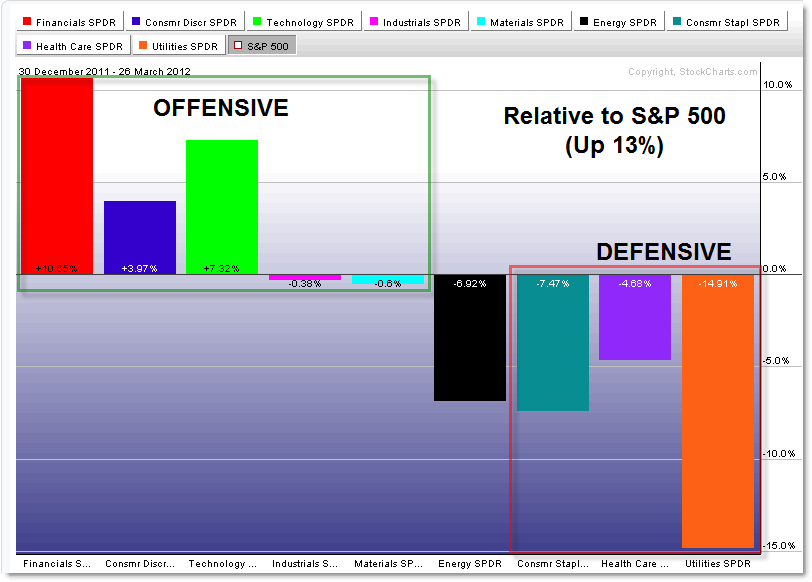
The next chart shows the sector performance RELATIVE to the S&P 500 (which is up roughly 13%):

This is just another way to view the performance where we ‘flatline’ the S&P 500 and then view the over or under-performance (relative to the 13% mark).
This perspective gives a clearer perspective of where sector strength or weakness resides – which is clearly in the Defensive (and Energy) sectors.
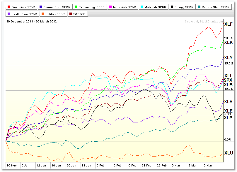
This next chart is a more advanced “Line” perspective of sector performance so far in 2012:

This chart is helpful to assess the trends in price, rather than the frozen “snap-shot” in time that the other charts provide.
You can also use it to view sector “clusters,” which is where different sectors cluster or travel together.
Two examples would be the XLI and XLB cluster (with the S&P 500) near 13% and the XLP, XLE, and XLV (defensive) cluster near the 5% line.
Again, the weakest sector is – and has been – Utilities (XLU) through 2012.
We generally do best to trade WITH sector trends rather than against them – meaning it would have been far more profitable to trade long with financials so far than trying to call a top and play a reversal.
The same is true with Utilities which were weakest from the start… and continued to be weak into late March (present).
Again, to me, the surprise from teh charts above is the Energy (XLE) sector which is registering a plus 6% performance – with all the focus on oil prices, one would expect the XLE to be among the top performers.
Anyway, continue watching the current Sector Performance for…
- any signs of continuation (which suggests further bullish stock market activity into the future) or else
- a reversal/rotation away from these developments (meaning a sudden reversal towards the Defensive Sectors and away from the Offensive Sectors would argue the opposite).
Be sure to view additional articles on previous Sector Rotation updates for more information:
“Sector Rotation Lessons and Insights from 2011” (important reference post)
“What the Sector Rotation Model is Saying in July 2011” (Bearish… and correct)
“Clear Bearish Signals Developing from the Sector Rotation Model” (May 2011 – right at the Top)
“Sector Performance from August to February (2011)” (Bullish insights)
Corey Rosenbloom, CMT
Afraid to Trade.com
Follow Corey on Twitter: http://twitter.com/afraidtotrade
Corey’s new book The Complete Trading Course (Wiley Finance) is now available!

very good, thank you
Hi,
Do any of you tried algo-mentor.com and has any recmds if i can use it ?
tnx,
Dan