Logarithmic Chart View of the Arc Patterns on the US Equity Indexes
The prior “Arc Update” posts have generated a lot of attention, and I wanted to continue that series with updated charts that answers a question that a few readers have asked:
“What would the arcs look like on Logarithmic Charts?” instead of the default arithmetic charts I’m showing.
Reference back to the prior updates for comparison, especially:
April 8: Updated Arc Patterns on the Four US Equity Indexes (arithmetic)
April 6: Rounded Arc Pattern (Update) on the NASDAQ
March 30: Short-Term Rounded Arc on the NASDAQ
Without further delay, let’s take a look and answer the question!
First, the Dow Jones:

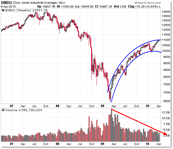
The Dow Jones remained within the arc on both scales, and the pattern is not much different (to me at least). What jumps off the chart at me is the lengthy negative volume divergence since the March 2009 low… but that’s another story.
Arc trendline boundaries exist between 11,000 and 10,000 – eerily located at “Round Numbers.”
Then the NASDAQ:

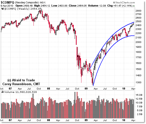
The NASDAQ chart does look different, given that the index is almost 100% higher (doubled) from the March 2009 low.
It almost looks like the NASDAQ is about to make a new recovery (but not lifetime) high beyond 2,800 (which is ‘only’ 350 points away).
The NASDAQ arc boundaries stretch from 2,500 to 2,150… and we’re not (really) seeing a stand-out negative volume divergence here.
On to the S&P 500:

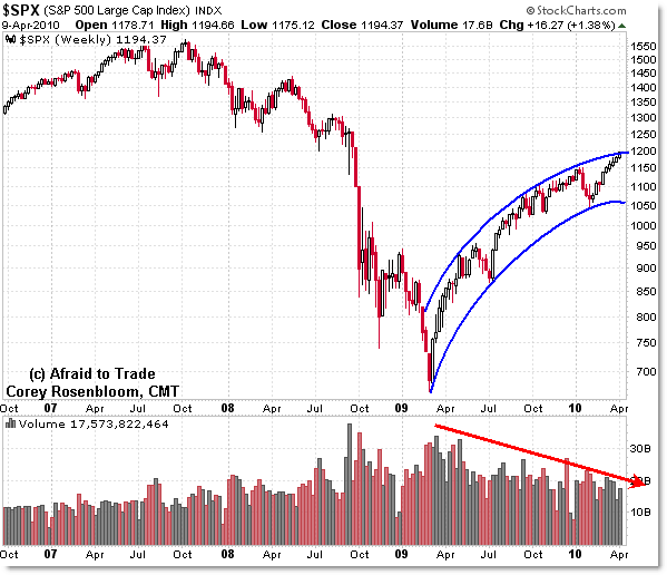
Like the Dow, we do see the negative volume divergence as the ‘arc’ has formed.
The S&P 500 arc is similar on both scales, with boundaries at the 1,200 level and 1,050.
The major difference is that the price is outside the arc (above) on the arithmetic chart and within it on the logarithmic chart.
Finally the Russell 2000:

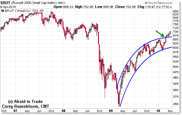
On both scales, the Russell 2000 (small cap) is outside the upper arc trendline boundary no matter how you draw it – that’s bullish (or could theoretically be a bull trap).
The Russell 2000 is often similar to the NASDAQ in structure, though to me, it would appear that the compression of the upper values on the Log-Scale chart obscures or masks the strength in the Russell (at least when compared to the arithmetic scale).
As a quick reference:
Logarithmic charts emphasize percentage changes as equal while arithmetic charts emphasize point changes as equal – thus, Log charts are used to discover or compare percentage changes over a longer period of time, or after a major decline or rally.
Log charts emphasize smaller price values (stretching out the lower end of the chart) while compressing/squeezing higher values.
For a comparison and discussion on how Trendlines are different – and they certainly are – between log and arithmetic charts, see my prior post:
“The Difference Between Logarithmic and Arithmetic Trendlines.”
Keep studying these type of charts for any signs of change and don’t let your indicators obscure the ‘pure price’ picture (or if so, at least take a few moments now and then to look purely at price).
Corey Rosenbloom, CMT
Afraid to Trade.com
Follow Corey on Twitter: http://twitter.com/afraidtotrade

Interesting charts. Could you draw an arc around the 2007 top ending on the march bottom for reference? Also perhaps a dashed mid-line for curiosity sake? What tool did you use to draw those lines?
thanks
Your article is always useful.
Thanks.
Extremely interesting… thanks. I'll have to take a closer look!
Extremely interesting… thanks. I'll have to take a closer look!