QE2 and Technical Analysis Signals in 10 Year Treasury Yields
Hmmm – if you just listened to the headlines, you would figure 10-year Note Yields would be going lower due to the QE2 Treasury Purchasing Plan from the Federal Reserve.
But not only is that NOT what happened, but the charts (technical analysis) were giving clear buy signals (rising yields) all along the way.
Let’s take a look at the chasm between words and charts, and how charts show reality via simple signals.
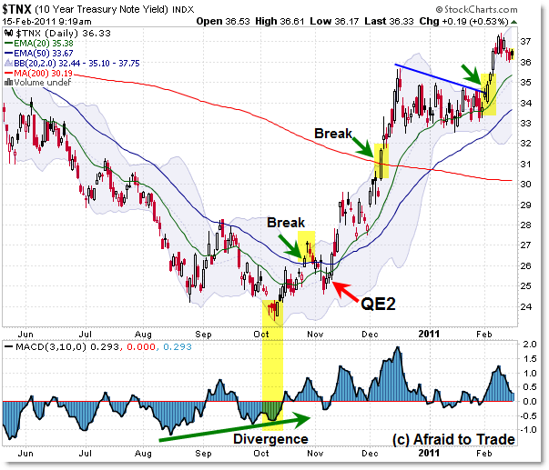
Here’s the 10-year Treasury Yield Daily Chart:

Rumors of the QE2 Stimulus Plan – wherein the Federal Reserve would purchase Treasury Notes/Bonds in an attempt to drive down the yield to make the cost of borrowing cheaper – began around the August 27th 2010 “Jackson Hole” speech by Chairman Bernanke and then were confirmed with the official $600 billion number on November 3, 2010 (actual purchases began mid-November).
Again, if you just looked at the headlines and stated goal of QE2 – driving down yields – then you were utterly confused as 10-year Treasury Yields rose from 2.4% to the current 3.7% level during this time of anticipated and actual intervention by the Federal Reserve (purchasing Treasuries).
What did the charts say as we do a walk-through analysis during this same time?
First, we had a clear positive momentum divergence going into the October low at 2.4%. Lengthy momentum divergences frequently – though not always – precede trend reversals.
But divergences aren’t enough – we need price to confirm via signals – such as breaking through a falling trendline or daily moving average.
Both of those components (trendline break and 50 day EMA) occurred at the end of October with a breakout above the falling trendline (not drawn) and the very important 50 day EMA which had simply held yields as resistance on the way down – until now.
When the official policy was announced November 3rd, Treasury Yields surged back above the 50 day EMA shortly after, and then broke to a new swing high on November 10th, completing the classic “higher low, higher high” early trend reversal signal. Strange, but true.
On December 7th, yields strongly surged above the falling 200 day simple moving average – a chart signal considered by many to be very important in defining the trend – this was a big bullish break.
Yields consolidated in a rectangle/flag chart pattern through January, and then yet again broke strongly to the upside in February 2011 which took us to the 3.7% level.
At present, yields are in the most bullish orientation possible – with price above the 20 day EMA, and the 20 day EMA above the 50 day EMA, with both being above the 200 day SMA.
Trend structure has also made higher highs and higher lows along the way.
As long as these components continue – and yields support on the 20 and 50 EMA – we can anticipate even higher yields.
Keep watching unless we get a similar reversal to the downside, as we already have a small negative momentum divergence forming at the 3.7% level.
This is a good example of how charts can give simple insights into the future – at least in terms of structure and probabilities – that are diametrically opposed to the headlines/news.
If you just took the Fed’s QE2 policies at face value, then you might have rushed out and bought Treasury Bonds along with the Fed, thinking “Well there’s no way price can go down – and yields can go up – when the Fed is on a campaign to buy Treasuries.”
But the charts told the true story, signal by objective signal.
Corey Rosenbloom, CMT
Afraid to Trade.com
Follow Corey on Twitter: http://twitter.com/afraidtotrade
Corey’s new book The Complete Trading Course (Wiley Finance) is now available!

And now, are you going to use divergence in the MACD (Dec 10 and Feb 11) and short?
JD,
No, not necessarily. Divergences are warning signals – not trading signals.
They need price trendline or EMA breaks – just like those from October 2010 – to confirm the signal.
Perhaps the MACD is now saying the FED is going to throw Mr. Market under the bus to bring yields down?
You are right. And that's why i usually fail in the moment to pick a reverse. Some kind of confirmation in needed
Yields been heading higher despite QE2 mainly on growth outlook. We are @ that phase of the business cycle where the 10yr -2yr spreads tends to widen dramatically. Despite so-so inflation via CPI, commodity market is telling a diff story. Rotation out of fixed income into risky stuff @ this point. =)
What about the macd divergence between the december peak and the february one?
Apologies didn't read the prior comments
Technical Analysis really works and helpful in effective investments. Usually many traders use this tool.