Quick Lessons from Three Bull Traps and Reversal Pathways
There have been three recent “Bull Traps” or initial breakouts that resulted in a sudden failure (reversal) of price and it’s always helpful to study the lessons from these recurring patterns.
Let’s take a look at three intermarket examples (Treasuries, the US Dollar Index, and the US Stock Market) and find the insights these examples offer us.
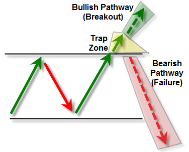
First, here’s a quick reference template for how we’ll view these examples:

What we see above is a simple representation of price (the large green and red arrows) within a sideways trading range or between two known reference trendline levels.
Let’s pretend that we freeze the chart on the initial breakout into the “Yellow Zone” or “Trap Zone” shown with a solid green arrow.
We’ll begin the discussion as if price was in this “make it or break it” status of completing a true breakout, or else reversing lower to trigger a “bull trap” and open a sharp downside reversal pathway that we can expect (and trade).
The bullish pathway is what buyers hope to occur, which is that price does break above resistance, generate a valid buy signal, and then continue trending in that upside direction. If so, it will be driven in part by short-sellers who sold short into the known resistance trendline (expecting the market to trade lower).
However, all traders need to be prepared for an “alternate thesis” or Bull Trap outcome wherein the price will return BACK under the ‘breakout’ trendline.
A few things happen in terms of supply/demand (buying/selling) pressure when price RETURNS under the visual support trendline.
First, the buyers who used tight or close stop-losses will immediately sell to liquidate a position for a small loss.
Second, short-sellers may either initiate a new short-sell position or else add to any existing short-sell positions put on before the price breakthrough.
Depending on whether the selling pressure – on the return UNDER the trendline – overcomes the buying pressure, we then have a tradable outcome which sets up an initial target to the lower support trendline.
In fact, in many cases, the price will actually trade very quickly or violently not just down to the prior trendline support area, but then break beneath it.
It’s the possible outcome that I want to focus our attention for the next three recent examples.
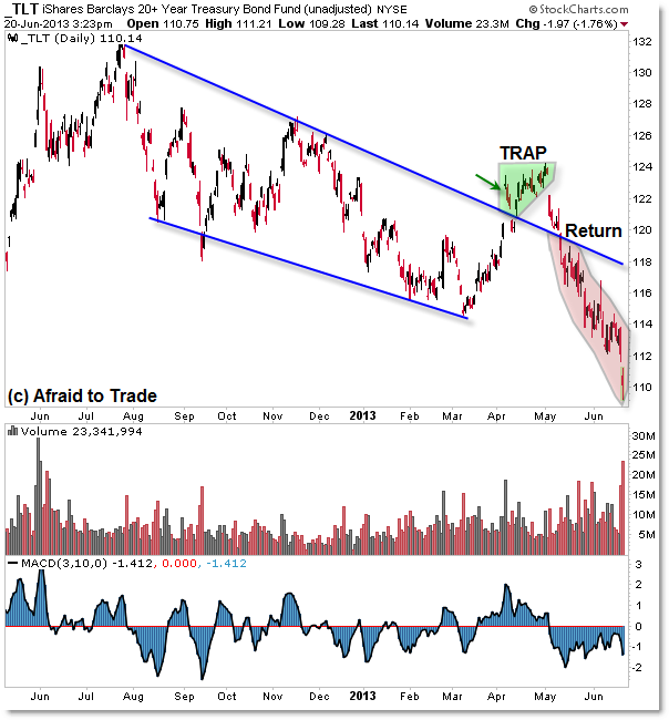
We’ll start with Treasuries (10-year ETF symbol TLT) and note the breakout, trap, and reversal:

Treasuries (seen with the TLT bond fund) continued a daily downtrend between two visual falling parallel trendlines from mid-2012 to March 2013.
However, in April price broke above the $120 per share level which was the falling trendline on an opening gap impulse.
As price continued trading higher to the $124 level, we noted a divergence in momentum and volume as price traded inside the “Caution” or “Trap Zone” just above the falling trendline.
In May, price gapped lower and then traded BACK under the falling trendline, resulting in a “collapse” straight down to where we are currently at $110 per share (beneath the lower support trendline at $112.
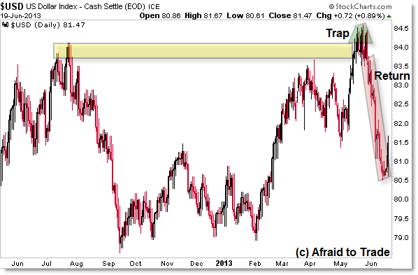
While the trendlines are different, a similar example occurred in May in the US Dollar Index:

From the Weekly Chart and even as we can see on the Daily Chart, the 84 index level was a critical target and resistance level for the US Dollar.
A late May breakthrough above 84 entered price into the Caution or “Trap Zone” at which point an intraday triple top pattern developed into 84.50 but for our discussion here, the index then reversed back under the 84 level and resistance/breakout trendline at the beginning of June.
We see the outcome as a ‘collapse’ straight down not just to the 82 and 81.50 prior support (price low) target, but down to 80.50 before the sharp rally higher.
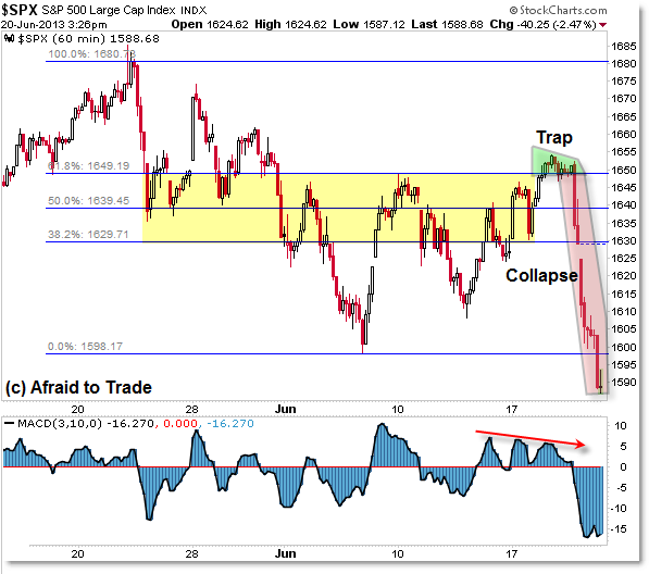
Finally, we see an Hourly Example in the SP500 Index with a particularly violent “trap and collapse” outcome:

The SP500 developed Range Consolidation trendlines around the 38.2% (1,630) and 61.8% (1,650) Fibonacci Retracement Levels as drawn from the all-time high in May to the spike low off 1,600 in June.
We recently saw an initial breakthrough above the prior swing high and 61.8% Fibonacci level above 1,650 but once again – like Treasuries – we saw a visual negative volume and momentum divergence that ‘undercut’ the breakout high.
Price entered the “Caution” or “Trap Zone” for one trading session (before the “Fed Day” Wednesday June 18) and then traded back under the 1,650 trendline reference level and has since “collapsed” not just to the 1,630 support trendline (the close of Wednesday’s session) but now toward AND UNDER the critical support target at 1,600.
What are the three main lessons we can learn from these examples?
Be very cautious on initial breakouts of visual resistance levels and check volume/momentum for signs of strength or weakness (divergences).
Even if there are confirming signs on the breakout, get ready to take a stop-loss in the event price returns back under the breakout trendline.
Failure to take a small loss on the return under the breakout trendline can – as we see from these three examples – result in an otherwise small loss ballooning out of control to a much larger and unnecessary financial loss.
Also, for very aggressive traders who see these “return back under the trendline” trap outcomes occur in real-time, it can be profitable to put on a short-sell or “failure outcome” position to bet on a failure or return back to the lower trendline as a target (or even beneath it).
It also reminds me of one of my favorite statements in trading – one I highlight frequently to daily members:
“IF something should happen but does not, THEN it often leads to a larger than expected move in the opposite direction.”
Join fellow members to receive daily commentary and detailed analysis each evening by joining our membership services for daily or weekly commentary, education (free education section), and timely analysis.
Corey Rosenbloom, CMT
Afraid to Trade.com
Follow Corey on Twitter: http://twitter.com/afraidtotrade
Corey’s new book The Complete Trading Course (Wiley Finance) is now available along with the newly released Profiting from the Life Cycle of a Stock Trend presentation (also from Wiley).


Good stuff cory