So This is What Resistance Looks Like in SP500
If you ever wondered what it looked like inside a critical resistance level in the S&P 500, look no further than this post and the action of the past two trading days.
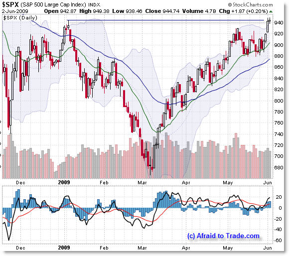
Let’s first look at the daily chart for the backdrop:

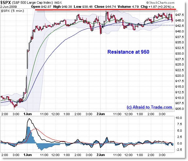
Bulls haven’t been able to push price above 950 – that could change suddenly in tomorrow’s trading, but for now, 950 is serving as important resistance which has formed a very interesting pattern on the lower-timeframes – almost reflecting a pure horizontal line just beneath this level.
Price managed to close right at the intraday January high which is mainly the only form of critical price resistance holding price back – bulls have already broken through lower-level Fibonacci confluences, EMAs, and the February swing highs.
Now, let’s step inside the chart to see the 5-minute price action to see key resistance at the 950 level and the massive consolidation that has formed.

You can almost feel it like steam trying to burst through a lid, or pressure building up that either will shatter this level… or fizzle out and fade away like mist.
It’s rare to see such a lengthy price consolidation at such a key level. Price already has already inched above a “Triple Confluence” level I mentioned previously at 940.
This post mainly serves as a point of interest, demonstrating how a higher timeframe can directly influence the behavior (support and resistance) of a lower timeframe, and why it’s important to know key technical price levels in advance if you trade mainly intraday.
Fascinating.
A reminder that I’ll be traveling to the Los Angeles Traders Expo (original blog post link) for my presentation on “Idealized Trades for the Intraday Trader” which may be broadcast Saturday afternoon as a webinar – I’ll keep you posted on that but I’ll be networking this week and am looking forward to meeting blog readers at the conference!
Corey Rosenbloom, CMT
Afraid to Trade.com
Subscribe for the RSS Feed here.
Follow Corey on Twitter: http://twitter.com/afraidtotrade

Thanks Corey. Couldn't this be considered churning under resistance?
Banks have rolled over the last 2 days, the VIX popped on Monday despite the broader market move higher, and the 2/10s spread in Treasuries indicate the foreigners are moving out of the long-end of the curve – which will put pressure on Bernanke's nuking of the $USD and force his hand on the quantitative easing front.
Commodities have shot higher as excess liquidity in the system due to the Fed's efforts have searched for an asset class, but the economic undercurrents won't support $75 oil.
The trend works, until it doesn't. My sense is the clock is ticking on this recent rally, and that is why the Banks and Reits are jamming the market with secondaries while the game is still on.
Thanks for the insights.
Clearly the last confluence zone in the S&P was a problem for the bulls. Ultimately, they prevailed and punched thru, but is this a breakout or did the effort exhaust? I'm tired just watching this play out.
One variable to consider is that of volume. In a rising trend, volume should go with the trend. However, volume does not appear to be leading here. Instead, there's a consolidating price pattern with declining volume.
Consider the 1 year/ daily chart (compress time to get a clearer picture of the trend in volume; declining). Alternately, view the 1 year /weekly chart; declining volume is even more pronounced. Is this a tell with respect to a pending reversal?
Also, consider todays “high wave candle” shown in the daily chart. The price action shows a serious back and forth, which denotes a struggle or pause. Is this candle pattern a possible “evening star” forming. A bearish confirmation would require a close below the real body of todays doji candle.
The next couple days should be interesting indeed! Thanks for eliciting this response.
The high in January was 943.85. We have actually closed higher than that today and spiked up to 947+
950 is a nice round number 🙂
non farm payrolls to be the trigger ? — one way or the other
I've only come to this conclusion today.
May 6th was the high. As of 6/2 the SP is down 3.21% based on SP/dollar index value.
Select the UDN tab to see how the SP is really doing.
http://stockcharts.com/charts/performance/perf….
With everyone waiting for a pullback based on the SP index, I think we are missing it because we aren't looking at it in terms of dollar value. May 22nd, when the SP closed at 888, we had a 38.2% retracement when looking at the SP per Dollar index and %gain.
Rally since early March was 19.26% gain in SP per dollar index terms.
Retracements would put the percentage gains down to
14.78% Gain = 23.6% retracement
11.9$ Gain = 38.2% retracement
9.63% Gain = 50% retracement
May 22nd we were down to a 10.73% gain. Hence we had a 38.2% retracement.
Looks like we are in a ABC / retracement for this rally but how it gets there depends on the dollar index and actual stock value changes. What the index number is could be ANYTHING, theoretically. I think if we just look at the SP index value we are missing it. I've only come to this conclusion today.
Also, from a previous post. Does anyone know how to annotate the chart normalized from UDN. Man ,would I like to add retracements, see MAs, RSI, MACD on this chart!!
I feel like traders, looking only at the SP index value are being played with a bit. Now the fed is taking money from home traders pockets, too, I think. Main stream America looks only at the index value too, but also see gasoline prices and make their judgement of the economy on those two things alone, I'd bet. Maybe interest rates add to that opinion if buying or selling a house. How's that for intermarket analysis! I just order a couple books on the subject based on reading the blog. Didn't even know what it meant 2 weeks ago.
This blog (and the stock market volatility) has help me to become more educated.
FYI, I used a timespan of 51 Days when viewing the chart, in order to see the %gain, I think that was a mistake ptting the start of the gain from March 20th.
I should have used 60 days timespan. This changes my conclusion.
%GAIN in SP from March 6th to June 2nd = 29.59%
22.6 % Gain = 23.6% Ret
18.3% Gain = 38.2% Ret
14.8% Gain = 50% Ret
On May 22nd we had 20.23% Gain – hence almost a 38.2% retracement.
Good luck on the presentation
Good luck on the presentation