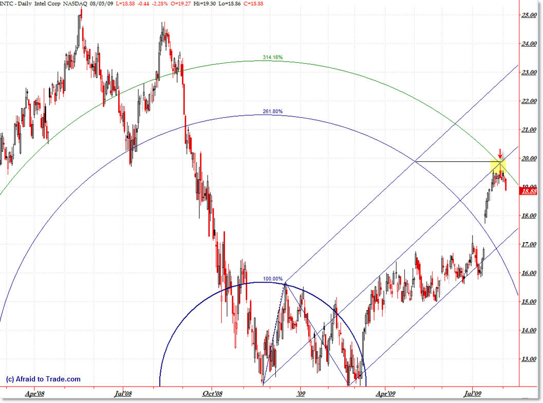
Intel INTC Chart Art Arc Resistance August 5
I’ve been slipping in some of my behind the scenes “Chart Art” posts that have been received well so I thought I would share another simple Arc and Andrews Pitchfork “advanced technique” analysis on Intel (INTC) which appears to have come into a possible inflection point. Let’s take a look.
Without divulging too much of the logic behind this chart, I’ve drawn Fibonacci arcs (standard TradeStation tool which is available on most platforms) off the first swing up off the November lows to the December highs. I’m using a Fibonacci 2.618 ratio as well as Pi (3.1416) for the arcs (using “pi” is no different than using ‘mystical’ Fibonacci ratios, particularly when dealing with arcs/circles).
I’ve also drawn a standard Andrew’s Pitchfork Tool off the same vector which is drawn to the February lows.
The 3.14 arc worked well in the past (notice how price ‘rode’ this arc through most of 2008 – odds are it should ‘work’ in the future… though there are never guarantees with any method). Looking back to verify arcs prevents you from drawing random arcs on price charts – the same logic works with advanced Fibonacci grids.
The point of this chart is to show that price rallied up into the 3.14 ratio arc as well as the middle line (50%) of the Andrews Pitchfork tool, and more importantly, a reversal (long upper wick) candle has formed at this confluence level, signaling that it might be an important inflection point to which we should pay attention.
The Andrews Pitchfork took has been confirmed in April and mid-2009 to contain price, which also gives it relative importance (instead of just drawing a random pitchfork).
Main idea – let’s watch to see if the $20.00 high holds as resistance and the downswing that appears to have formed off this level continues – if so, that would be negative for the stock market.
Remember, there’s no magic in the stock market – this is just one of the advanced methods to uncover potentially hidden resistance areas other traders aren’t seeing.
Corey Rosenbloom, CMT
Follow Corey on Twitter: http://twitter.com/afraidtotrade


Hi Corey, very interesting post. The July High also magically corresponds to the 50% fibonacci retracement line from the 2 year high of approximately 28 dollars.
That's right! I missed that.
It also retraces into the 61.8% retracement of the 2008 highs to the 2009 lows which is about where I drew the small black line just beneath $20. So $20 has potentially powerful resistance at $20 – which is also simple 'round number' resistance.
Going to follow this to see the outcome.
I tried to duplicate this in my charting service and it looks completely different. The 2.618 and 3.1416 arcs are not at all close to where they show up in your example. Really confused….
When I draw from the Nov low to the Dec high the arcs don't go out nearly as far, they show breaking through them back in March.
So which one of us is doing something wrong?? 😉
I meant to say they show price breaking through the arcs back in March.
The secret to drawing chart arcs is to make sure your price and time grid is equal. In other words, look closely at my grid above to note that the grid forms perfect squares (or as close to perfect as possible, given that some months are longer than others).
This means you have to scale the time and price axes.
The best way to do this is to draw a 45 degree screen angle and overlay horizontal and vertical gridlines and ensure that 45 degree angle begins at the lower left of any square and runs through the top right of subsequent squares.
Your arcs will be wrong if you don't use this technique.
See comment below about ensuring you have near perfect squares in your gridlines – in terms of the time (bottom) and price (right) scale.