The Intermarket Big Picture to Start March
What does the 10,000 foot view look like in the Intermarket Landscape as we begin March 2012?
Let’s take a look and see what the broad markets reveal:

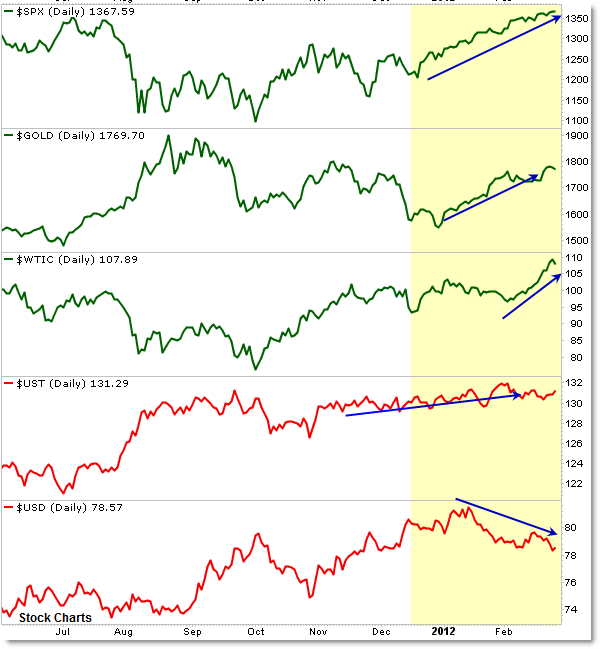
First, it’s good to divide the markets in to “Risk-Off” or defensive/safe markets (such as Treasuries and the US Dollar Index) and “Risk-On” or offensive markets such as stocks and commodities.
Rather than charting the broad CRB (Commodity) Index, I prefer to look at gold and crude oil separately.
I’ve colored the “Risk-On” markets green and the “Risk-Off” markets red.
So what does the picture say?
With the exception of Crude Oil, ALL markets have been steadily rising or at least showing some sort of upward movement since mid-2o11.
In context, August 2011 gave us the “Stock Market Crash” and Gold Surge along with a surge in Treasury prices and later in the Dollar.
Since the August bottom, the only market to suffer has been Gold – which is somewhat odd.
Nevertheless, if we view the current picture from 2012 to present, all markets except for the US Dollar Index have been strong and rising – even Treasuries.
In general, the Dollar Index trades opposite of both Stocks and Commodities, so this is logical, but the strength in Treasury prices have been the “odd market out” in 2012.
While I prefer viewing the large perspective using simple line charts, you may prefer to see them as candle bars:

The most recent developments are the strong surge/breakout in Crude Oil along with the movement lower in the US Dollar Index.
I’ve written frequently about the “Creeper Trend” in stocks, and that situation remains the same going into March.
Stepping outside the charts, market participants have been intensely focused on recent economic data which show improvement and the evolving situation regarding Europe.
I find it helpful to view these markets as part of a larger whole instead of individually, paying attention to movements in the cross-market landscape.
We should always be looking for strange behavior (like the continued strength in Treasuries despite continued rallies in stocks and commodities) along with corresponding reversals (stocks/commodities suddenly reversing down while the Dollar reverses up).
Take a few moments to study the charts above and create your own charts that show the cross-market structure in more detail.
Corey Rosenbloom, CMT
Afraid to Trade.com
Follow Corey on Twitter: http://twitter.com/afraidtotrade
Corey’s new book The Complete Trading Course (Wiley Finance) is now available!

I just wonder, if you have a data base or spreadsheet for this charting you made?
How do you illustrate them. Thanks, I would like to know more.
My blog : porte bouteilles