April 6 Update on the Rounded Arc on the NASDAQ
A reader asked me to update the March 30 post “A Rounded Arc Forming on the NASDAQ Index” and I thought that was a good idea, given that the arc is continuing to form on the intraday charts – spanning two months now.
Let’s take a look at the updated “NASDAQ Arc” charts:

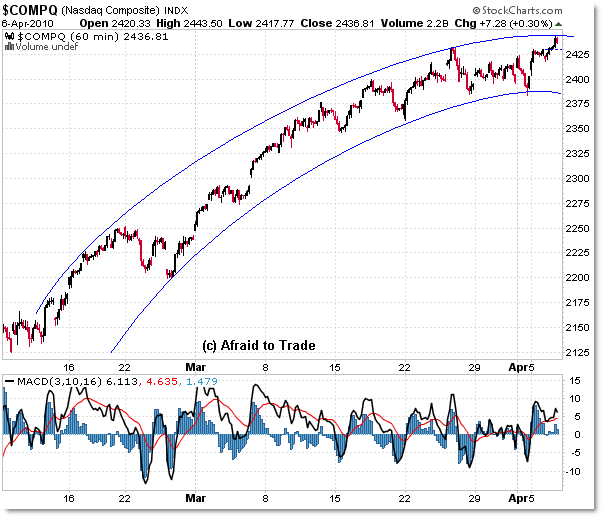
The 60 min chart provides the best look at the entirety of the arc, starting with the February 2010 lows and continuing until today.
Just think of arcs as slanted or rounded trendlines – that’s really all they are.
What I’m basically saying is that the NASDAQ (and other US Equity Indexes) have traveled between two parallel ‘arc’ trendlines, and likely will continue to do so unless we see a specific breakout of the trendlines.
Yes, that means that if the rounded arc continues, that we’ll see a gentle roll-over to the downside in price just as you would expect price to continue traveling inside parallel trendlines like a rectangle.
The current arc trendline boundaries rest at the 2,450 area as upper ‘arc’ resistance and 2,375 as lower ‘arc’ support.
Notice the negative 3/10 Momentum Oscillator divergences also serving to complete the arc – this is exactly the pattern (in the oscillator) you’d expect to see when an arc (“Rounded Reversal” or scallop) pattern forms on any timeframe – negative divergences in the oscillator.
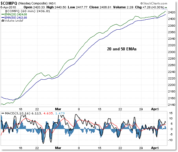
It’s often best to use pure price to see (visualize) the trendlines or arcs, but moving averages can also be helpful, as seen in this ‘moving average’ only chart:

This is the 20 (green) and 50 (blue) Exponential Moving Averages (I could have used simple as well) on the 60-min frame (with price invisible).
You can see an arc forming in the averages, which was permeated with a slight rise as a result of the last two days’ price action.
Watch for an official signal to come when the 20 (shorter term) EMA crosses under the 50 (intermediate term) EMA.
If we don’t see that cross, then continue trading with a long/buy bias (mostly from an intraday basis to guard risk).
Like all patterns, rounded reversals aren’t perfect, but do provide a relatively clear roadmap into the future when they ‘work’ (hint – look for price to fall slightly faster or to a similar degree as the rise).
Corey Rosenbloom, CMT
Afraid to Trade.com
Follow Corey on Twitter: http://twitter.com/afraidtotrade

Corey
I've been beating my brain trying to figure out how you drew the curved line in StockCharts. I'm stumped though. Can you share your secret to this? Is it actually something you're doing outside of StockCharts' annotation function?
Thanks
if you look at any index from 2009 the whole rally looks to have an arc.
That's true!
I'll have to do a follow-up post on that!
Jedi mind tricks!
Kidding! I use Snag-It image capture & editing software and its arc tool.
Aha! That explains it. Thanks
Your article is always useful.
Thanks.
Corey – do you have a specific preference between SMA's vs EMA's ?
This is a great article. Thanks for the update!
Can you take a look at Dell, and Yahoo? I think Dell just have a break out from a rising triangle yesterday, and it seems correct from today's action. However, I have trouble to figure out what to expect next for Dell. And for Yahoo, I thought there was a break out yesterday too. But today's result make me think not yet. Thanks a lot
Will do! I'll try to put these up this evening. Thanks for the request!
When trading, I tend to prefer EMAs (for 20 and 50) and SMA for 200 period on all timeframes.
The shorter-term EMAs 'hug' the price action better and tend to be more reactive.
But it's not magic or absolute – more of personal preference.
This is a great article. Thanks for the update!
Can you take a look at Dell, and Yahoo? These two have a similar rising triangle look on daily chart., which is my favorite chart pattern learnt here. I thought Dell had a break out yesterday, and it seems correct from today's action. However, I have trouble to figure out what to expect next for Dell. And for Yahoo, I thought there was a break out yesterday too. But today's result make me think not yet. Thanks a lot
Will do! I'll try to put these up this evening. Thanks for the request!
When trading, I tend to prefer EMAs (for 20 and 50) and SMA for 200 period on all timeframes.
The shorter-term EMAs 'hug' the price action better and tend to be more reactive.
But it's not magic or absolute – more of personal preference.